30 Days to Success in Power BI: Day Six Adding More Data
Welcome back to day six of our series on Success in Power BI! With 30 days of Power BI learning, we should be able to be successful with our use of the desktop tool. Have you forgotten where we left off from day five? If so, here is the link to refresh your memory.
Before we get started from where we left off, let me show you a nifty little feature in Power BI Desktop. If you select the Data / Drill tab on the ribbon menu and select the See Data button, you can see all of the data points mapped including the Tooltips data points just below the graph as seen in Figure 1.
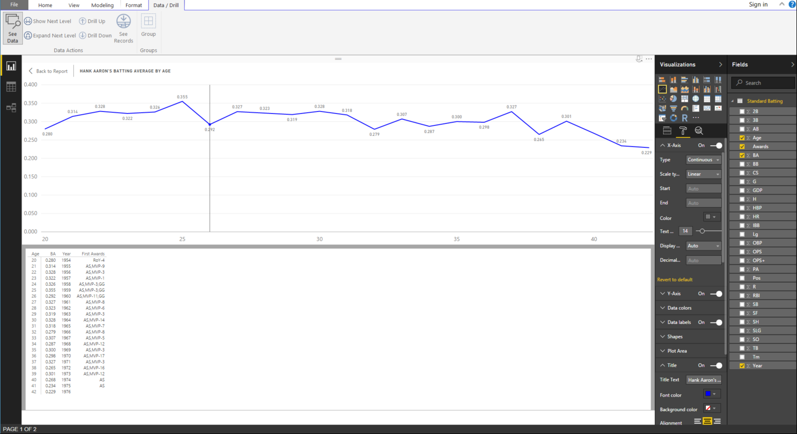
Figure 1 – Drill Data
Let’s go through some definitions to help your understanding of baseball terminology in statistics:
At Bats (AB): a statistic that counts a plate appearance only if the batter produces a hit, an out, an error, or a fielder’s choice.
Base on Balls or Walk (BB): when a pitcher throws four balls and the batter is subsequently awarded first base.
Batting Average (BA): a statistic that is defined by the number of hits divided by the number of at bats.
Hit (H): a statistic where the batter safely reaches first base without an error or fielder’s choice.
Hit By Pitch (HBP): this occurs when a pitcher hits the batter with the ball and he is awarded first base.
On-Base Percentage (OBP): a statistics defined by the sum of hits, walks, and hit by pitches divided by the sum of at bats, walks or base on balls, hit by pitches, and sacrifice fly balls. In other words: OBP = (H + BB + HBP) / (AB + BB + HBP + SF)
We went through that exercise to help you understand the difference between batting average and on-base percentage. These are two of the main statistical comparison points for offense in baseball. Therefore,we will now add the OBP field to the graph. We can drag that from the Fields pane on the left to the Values slot in just to the right of there as shown in Figure 2. Theoretically, OBP should always be greater than BA because batters can get on base for more than just a hit, as shown above in the definitions.
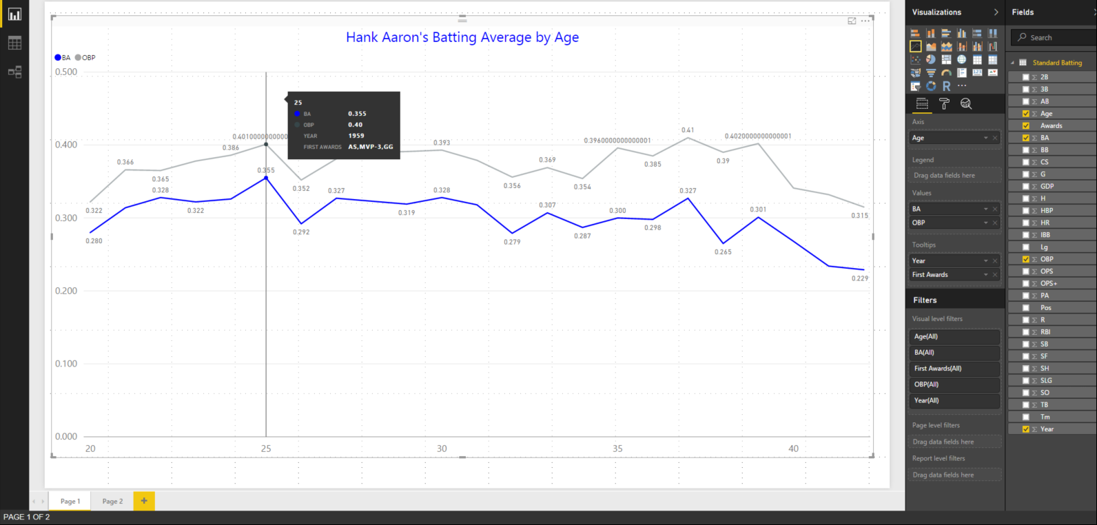
Figure 2 – Adding On-Base Percentage (OBP) to the Visualization
Let’s make some formatting changes to clean up our addition. First, let’s change the title to reflect our added data as sown in Figure 3 with the blue arrow. Now, we can change the OBP line to green as shown with the green arrow so that in stands out in comparison to the blue of the BA. Now let’s add a legend, place it in the bottom center, increase the font size, and color it red as shown with the red arrow. We are fast becoming pros at Power BI. Did we miss anything? Take a good look.

Figure 3 – New Formatting
Did you see it? The data labels are showing some crazy decimal places. Let’s tidy that up too! Go back into the dataset and change the formatting from Auto to three decimal places for OBP as shown in Figure 4. We should go ahead and do the same for SLG and OPS while we are in there in case we want to graph them later. We did this in day five for batting average.
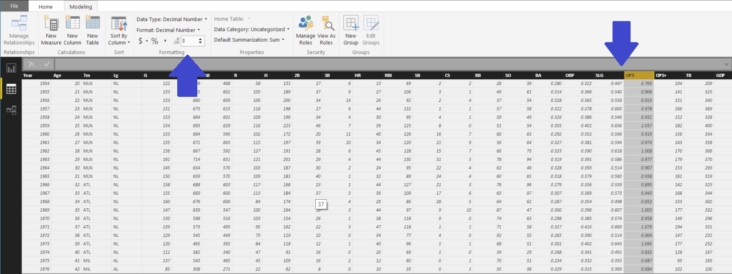
Figure 4 – Clean Up OBP, SLG, and OPS
Here in Figure 5 we see the finished product. A visualization that we can be proud of. Stay tuned tomorrow to see where we go next!
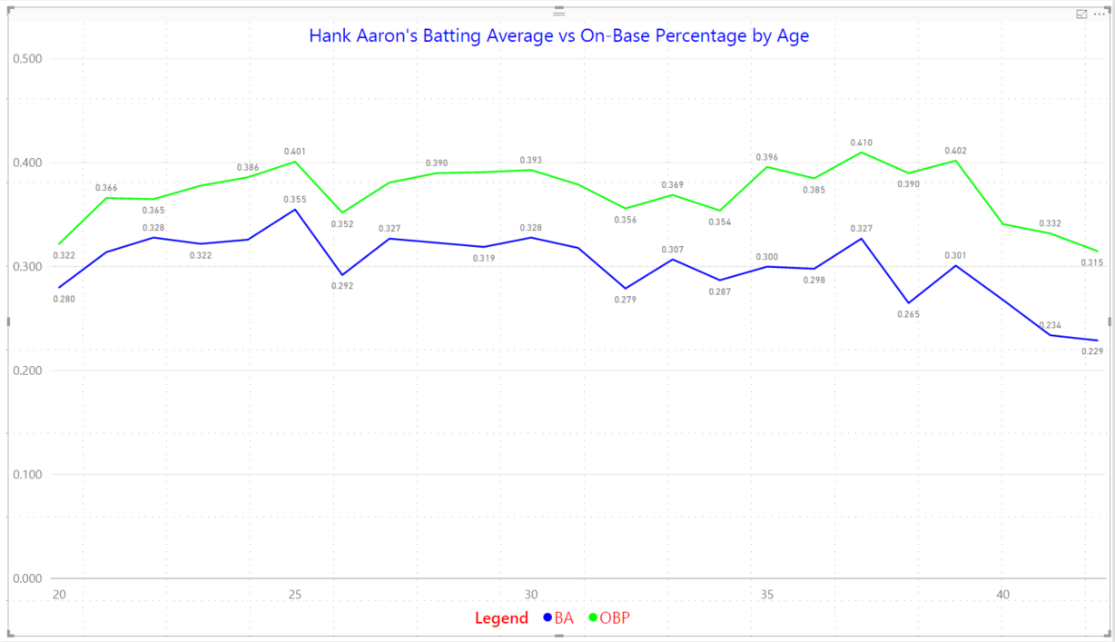
Figure 5 – Finished Visual
30 Days to Success in Power BI: Day Five Making It Pretty
Welcome back to day five of our series on Success in Power BI! With 30 days of Power BI learning, we should be able to be successful with our use of the desktop tool. Have you forgotten where we left off from day four? If so, here is the link to refresh your memory.
So for today let’s tidy up our visualization to make it a little more appealing because a polished visual is needed to give to executives, right? The first thing we are going to do is add some tooltips. These are designated fields of data that will show when you hover over data-points on the graph. Our data tells a story, so let’s add some details to tell it properly.
In Figure 1, you can see by the red arrow that we’ve dragged over the Year and the First Awards fields from the dataset. When we highlight over a data-point (as shown in the green arrow) we will get a tooltip that shows the age first (39) then the Batting Average (BA 0.30). Now, we can also see that the Year was 1973 and we can see some awards (AS, MVP-12). The original website designates these as an All Star selection year and he also finished twelfth in the Most Valuable Player award voting that particular year. That data may not be as useful in this case but it is a great addition to see that he was 39 in 1973. It helps to explain our insight a little better.

Figure 1 – Adding Tooltips Details
Now let’s cleanup the data-points for the batting averages as baseball generally sees this statistics in the thousandths places, such as batting 0.300 which is pronounced three hundred. As you can see in the Figure 1 Tooltip, it shows that he batted 0.30 which is really 0.301 and that extra one makes all the difference in the world in baseball.

Figure 2 – Format to the Thousandths Place
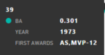
Figure 3 – Tooltip Updated
In order to get the tooltips to show three places, we need to open the dataset again as shown in Figure 2. We highlight the BA column and go to the Formatting area on the Modeling ribbon. There is a decimal control there (see red arrow in Figure 2), press up until you get to three. Notice at the blue arrow we see the average of 0.301. We can now see if we switch back to the report view and hover over the same spot, we will now see 0.301 as shown in Figure 3. But the Y-axis is still showing only two decimal places. We should correct that for consistency sake.
In the Visualizations Pane, we select the Format tool (Figure 4, blue arrow that looks like a paint roller). This brings up a formatting menu where we can change many aspects of the visualization. In this case we want to increase the font on the X-axis to 14 (Figure 4, orange arrow). Then we will do the same for the Y-axis (Figure 4, red arrow). However, we will also change the scale with the starting point being 0 and the ending point being 0.360. This will give our chart some depth and make it more linear in scale. We will also change the decimal field to three so that our axis matches the accuracy of our tooltips.

Figure 4 – Axis Clean Up
Let’s also change the color of the line graph as I really don’t like the default colors in Power BI. It reminds me too much of the cyan from the limited color scale available on my 1980’s IBM PC. If you select the Data Colors control and then change the Batting Average data to Blue by entering the #0000FF hexadecimal code or selecting blue from the custom palette as shown by the blue arrow in Figure 5. Right below there we will see the Data labels control by the red arrow. We can set that to On and now see the data points with actual labels. This feels more presentable to me.

Figure 5 – Color with Labels
Are we done yet? Not yet. This visualization needs a catchy title as you will notice in Figure 5 in the upper left hand corner a small font with a couple of words defaulted there. Let’s change that to something more visually stimulating for the end-user. If we keep scrolling down on our Formatting area, we can see the Title control. Select that control and change the title, give it a blue color, and center it as shown in Figure 6 near the blue arrow. We’ve now completed our first visualization and it looks most impressive. Good job. Stay tuned to day six!

Figure 6 – Nicer Title
30 Days to Success in Power BI: Day Four Our First Visualization
Welcome back to day four of our series on Success in Power BI! With 30 days of Power BI learning, we should be able to be successful with our use of the desktop tool. Have you forgotten where we left off from day three? If so, here is the link to refresh your memory.
So let’s create a visualization today in Power BI. For clarity’s sake, the Power BI desktop consists of reports, visualizations, and datasets. We’ve already built a dataset in the previous couple of days. Now, there is a difference between reports and visualizations. A visualization might be a pie chart or a map. A report, however, can contain one or many visualizations in order to present your data insight. Therefore it might contain a pie chart and a map to present the data cohesively in order to understand the insight we are presenting. Make sense?
So let’s get started. If you look at Figure 1, you’ll see the red arrow pointing to the available visualizations. You’ll also see where I clicked on the ellipses icon in the bottom right area and brought up a menu to import visuals (another name for visualizations). I am mentioning this to let you know that you can download custom visualizations!! Some are pretty fun and create memorable visuals for your intended audience. You can download these at https://app.powerbi.com/visuals/ and install them on your Power BI Desktop installation. For our purposes, however, we will stick with the standard visuals for now until we get up and running.

Figure 1 – Visualizations
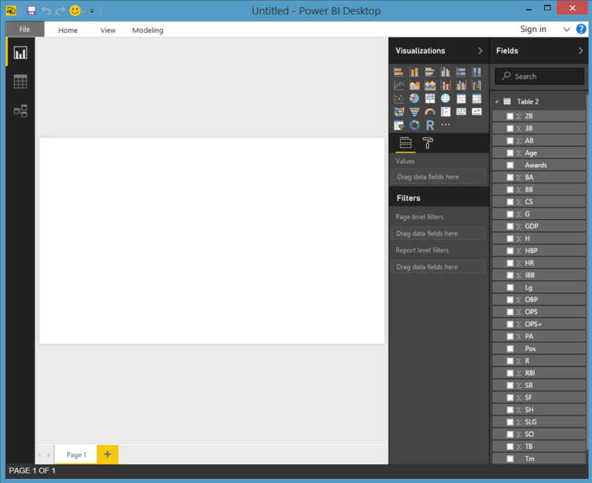
The first step to creating a visualization on our blank canvas is to choose one from the Visualizations area (highlighted in Figure 1) and click on it. We are going to select the Line Chart visual which is highlight in Figure 2 (first on the left of the second row from the top). This will drop a blank line chart visual onto your page as shown in Figure 2 on our white page.

Figure 2 – Line Chart Starting Point
Now you can see the dark area (called Fields and Filter pane) below the visualizations has changed between Figure 1 and Figure 2, depending upon the visual that was selected. This is probably the most difficult part of Power BI, in my opinion, as these titles do not seem very intuitive to the lay person (nor me the data professional, lol).
For this line chart, we want to see Hank Aaron’s batting average by his Age as players’ performance tends to decline as they age (as do all of us eventually). So if you look to the far right, you can see our data set fields. From here we can drag the batting average (depicted as BA) field over to the Values slot and then the Age field to the Axis slot. We will now see hit batting average on the Y axis and the age across the X axis as shown in Figure 3.

Figure 3 – Line Chart Configured
Obviously, we cannot see this visual so let’s grab the bottom corner and drag it across the page as shown in Figure 4. Not sure if you have the data in the right slots? Try different configurations to see if this is the insight you are trying to communicate. I tried reversing these and it made no sense in this situation. We really want to see an increase or decrease as the player ages.

Figure 4 – Line Chart Expanded
So now if you look at Figure 5, this is what we saw on the original web page for Hank Aaron’s major league batting statistics from Baseball-Reference.com. We have now taken our batting dataset and turned it into a workable visual. It’s not pretty. Yet. This is a great stopping point. See you on day five!

Figure 5- Batting Web View

30 Days to Success in Power BI: Day Three General Housekeeping

Figure 1 – Renaming Table 2
Welcome back to day three of our series on Success in Power BI! With 30 days of Power BI learning, we should be able to be successful with our use of the tool. Did you forget where we left off on day two? If so, here is the link to refresh your memory.
Today we are going to do some general housekeeping to get ready to use the data we loaded. This will help us understand Power BI desktop a little better and get us ready to create some amazing visualizations.
If you remember yesterday we clicked on the data icon on the left toolbar and then we could view our data set that we loaded from the web source. To avoid any confusion when or if we load more data, let’s first change that name of the table. We are going to rename Table 2 to Standard Batting, as it was labeled on the website.
Now we need to do a cursory check of the data. It is important to make sure the data loaded is the data that we want to report off of and also to ensure that there were no errors from some questionable web programming.
If you look at Figure 2, you’ll see we have two rows at the top for years 1952 and 1953. Those are for the minor leagues. We do not want those included in our visualizations as we are comparing Hank’s professional career and it is a generally accepted practice to include only major league statistics in that comparison due to the breadth and level of competition.

Figure 2 – Batting Data View
So now if you look at Figure 3, this is what we saw on the web page for Hank Aaron’s major league batting statistics and what we thought we were loading originally. The website, Baseball-Reference.com, is using some programming to hide minor league stats (as you can see a button called Show Minors). We might not have noticed this, but its an import step to note when loading data from web sources.
Figure 3 – Batting Web View
So we need to remove those rows so that we can get an accurate professional representation of Aaron’s performance. Sounds easy, right?

Figure 4 – Delete Row or Column?
Not so fast. When we click somewhere in the grid, it highlights a column, and when we right-click to choose delete (as shown in Figure 4), it appears that the column will be deleted and not the row. Trust me, it will be the column deleted. So how do we delete the row?
Let’s click on the Edit Queries icon on the Home toolbar (or ribbon) at the top of the screen. This will load the data into a Query Editor window (giving you two active windows). We can highlight rows here but we still cannot delete them. However, if we imagine this is Excel, then we can use the filter ability to remove our the two rows. Click on the down arrow at the column header for Year. Now deselect 1952 and 1953, as shown in Figure 5. Select Ok to make it happen captain.

Figure 5- Removing Rows
I want to point out here in Figure 6, that the rows are gone. But, I also want to point out the section on the right of the screen called Applied Steps. At this point, we have not committed any changes yet. However, this is a list of steps that we’ve done thus far in our manipulations. We can change that list or step through that list and watch the data change, if we choose.
So, if you click on the Changed Type step, you can see the two rows are there again. You can also click the delete icon (X marks the spot on the right of the step) to remove the step. Thus, if we decided to leave those two years in there and cancel out the changes that we made, we could then click the X and delete the Filtered Rows step. We could also do several other things here in the data if we needed to before applying the changes.

Figure 6 – Rows Removed
In this case, we did not really delete rows as they are filtered out just like in Excel, but they are removed from our visual data set that we will report off of. It is essentially smoke and mirrors as shown in Figure 7. This is a great stopping point. See you on day four!

Figure 7 – Smoke and Mirrors
30 Days to Success in Power BI: Day Two Loading a Web Data Source
Welcome back to day two of our series on Power BI! Are you sore from yesterday’s heavy lifting? No? Good. Did you forget where we left off? Here is the link to refresh your memory.
Today we are going to start with loading some data from a web data source. There are a ton of great data sources out there but I chose Baseball-Reference.com because of the wealth of information and statistics available there and I personally love baseball. It doesn’t matter if you are a baseball fan or not as this is just a demonstration. Feel free to find a different site for your favorite sport or activity.
Hank Aaron is generally considered to be one of the greatest baseball players of all time so we will grab some of his statistics and break them down in Power BI. With my company, Innovative Architects, being based in Atlanta, we’re pretty fond of Mr. Aaron here at the office. So let’s see where this takes us for this adventure.
Let’s start with opening Power BI. We are greeted each time with this great modal dialog box. It is a great spring board. We can open a previous project or start a new one by clicking on Get Data.

- Select Get Data to get started on our journey.
- Select Other to get to the Web data source option and select Connect.

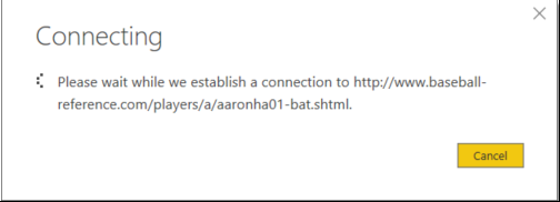
- Select Web. Type in http://www.baseball-reference.com/players/a/aaronha01-bat.shtml and select Ok. This page will give us some lifetime stats for Hank Aaron so we can do some visualizations.

- We are now connecting to the data into Power BI.

- Now the fun part: figuring out which data that we want to load. Look at all of these tables. Which one is ours?

- Let me show you a trick. Click on the Web View tab around the middle of the screen. It will show our web page data as it appears normally. However, it will also label the tables so that we know which one we want to load. Snazzy, huh?
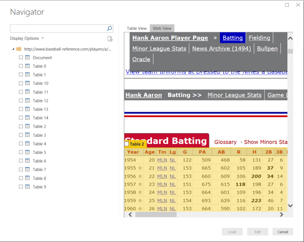
- From here we can click on the Table 2 check box near the Standard Batting title for the table. That was much easier, huh? Select the Load button and Power BI will now start to load the data into the tool.

- When that completes, we will actually have data loaded into Power BI to begin our work. If you look at table 2 on the right, you can see all of the columns that we saw on the web page.

- If we click on the data icon in the middle of the three icons on the right hand side of the screen, we can actually see the data. The other two show the report and the relationships between tables. We will get into that later on.

- Let’s Save the File as Hank Aaron and pick up again on Day Three. Good job! We are data visualization gods, right?


30 Days to Success in Power BI
In the SQL Server community, I’ve seen quite a few 30 day blogs. I love the format with the idea being that you read the blog once a day for a month to master a new skill. Let’s go on adventure to learn PowerBI!
PowerBI is the latest Microsoft Business Intelligence tool. This tool, however, is considered a self-service tool in that it lets users create the data visualizations that they want to see instead of waiting for your in-house report writers to create a report for you. Excited yet? Don’t worry, you will be. It is a fun tool. Let’s get started.
Recently, I completed my first PowerBI project for a client of ours at Innovative Architects. It only took a couple of days to deliver multiple dashboards and they were beautiful if I do say so myself. This project inspired me to blog about getting started with PowerBI.
So day one needs to be getting PowerBI installed and ready to go. The first thing we do is to download the software at https://powerbi.microsoft.com/en-us/get-started/ using an email address. This is important because PowerBI is getting monthly updates and the tool is adding features every month. You really want to know about them as they are released.
- Let’s start the installer and get this party going!
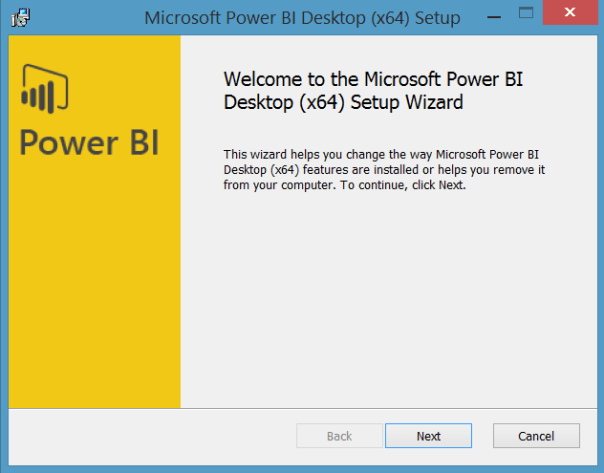
Figure 1: Basic Installer Starting Point
- Strait forward so far, right? Click Next.
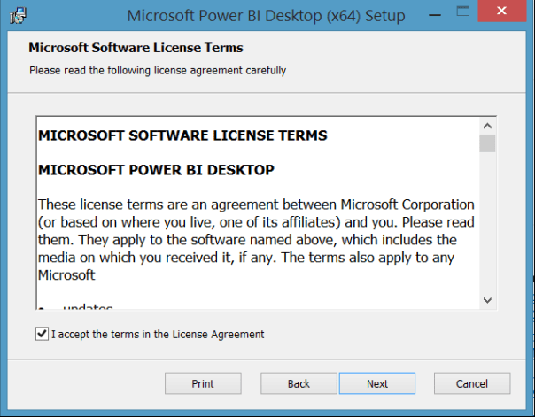
Figure 2: Basic License Acceptance Screen
- Check the acceptance box and then click Next.

Figure 3: Choose an Installation Folder
- Choose an installation folder by clicking Change or click Next to continue with the default location.
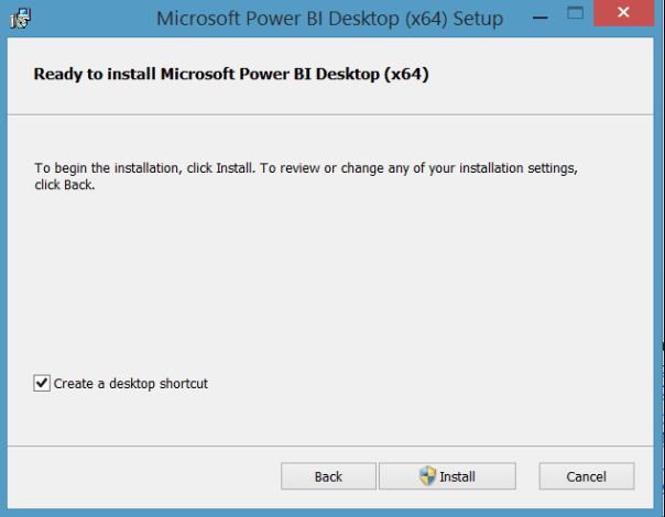
Figure 4: Let’s Install Now!!
- Click Install to begin.
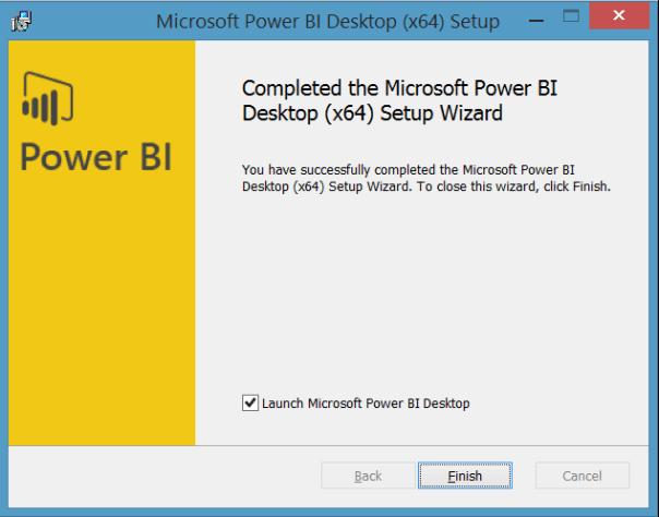
Figure 5: We’re Done!
- Click Finish to end the installation. Wow, that was easy!
I told you it would be fun, right? We have now installed PowerBI Desktop. We’re should probably take the rest of today off. See you tomorrow!
Read the full series here:
- Day Two: Loading a Web Data Source
- Day Three: General Housekeeping
- Day Four: Our First Visualization
- Day Five: Making It Pretty
- Day Six: Adding More Data
- Day Seven: Adding Simple Analytics
- Day Eight: Adding More Analytics
- Day Nine: Line and Clustered Column Chart
- Day Ten: Add New Calculated Columns
- Day Eleven: Adding a Second Visual
- Day Twelve: Adding a Slicer
- Day Thirteen:
- Day Fourteen:
- Day Fifteen:
Taking Atlanta to a New Level… #SQLSatATLBI
 Having moved from Tampa a couple of years ago, I always wondered why Atlanta only had one SQL Saturday per year. While Tampa has two SQL Saturdays, one regular event and one specifically for Business Intelligence (BI). Atlanta, however, is the big daddy of SQL Saturdays (ok, ok, technically we are the second biggest SQL Saturday in the world but only by a few people and only because our venue will not physically hold anymore people thanks to that darned Fire Marshall and his silly rules about people cramming into a room). Thus, it seemed only natural that Atlanta would also have a BI event with such a vibrant BI user community here.
In my consulting role at Innovative Architects, I’ve been doing quite a bit of BI projects and I absolutely love having irons in both fires. In addition, there were a lot of people here that were interested in helping with an additional SQL Saturday. We just needed a push to get it off of the ground. Enter my co-worker Damu Venkatesan (t) who said “OK, let’s do this now!” A few months later and we have moved to the wait list for registrations, we have almost sold out our sponsorship slots, and we have an amazing line-up of speakers. Maybe I am biased, but I’ve been to at least thirty SQL Saturdays in my career and I think this is as good of a schedule as I’ve ever seen. After the schedule was announced, the registrations filled up at a frantic pace.
We also had a few big names in the community submit pre-conference training abstracts for Friday, January 8th. We ultimately decided on having two sessions for our first year even though we had several great submissions. We finally decided upon SSIS Design Patterns and BIML: A Day of Intelligent Data Integration by Andy Leonard (b|t) for our first session. Our second session, Microsoft BI In a Day, is being presented by Microsoft employees Patrick Leblanc (b|t) and Adam Saxton (t) who is also known in the community as Guy In A Cube (yt|t).
Below are some PowerBI visualizations, because this is a BI SQL Saturday! Enjoy!

#SQLSatATLBI Speakers From Across the Country

#SQLSatATLBI Track Level Distribution
A Handful of SQL PASS #Summit15 Tips
The annual SQL PASS international conference will be here in less than a week. OMG!!! It’s been a year already? First of all, if you haven’t registered yet, then why not? It is THE event for the SQL Community or #SQLFamily as we like to refer to it. Still not sure about attending, then check out this page. I promise that you will not be disappointed.
For those of you who have registered have you looked at the schedule yet? Do you know all of the great speakers that you want to see? Are you coming to see me compete in the Speaker Idol contest? I will be up in the first round on Wednesday from 03:15 PM – 04:30 PM in TCC 101. If I survive (and win) round one, then I will be competing in the final on Friday from 03:30 PM – 04:45 PM in the same room. Come see eleven other great speakers compete for a chance to receive a guaranteed speaking slot in next years Summit, but mainly come to cheer me on with three hundred of my closest friends.
Now with the shameless plug out-of-the-way, on to the main purpose of this post. Here are my tips for enjoying #Summit15:
- Meet people! Shake hands, but more importantly give them a big #SQLHug. We (well most of us) love #SQLHugs. Find me, give me a #SQLHug. I will be glad and happy to meet you! Standing in line for a coffee at the conference? Say hello to someone, introduce yourself. Set aside your introverted ways for this week!!
- Follow people on twitter before hand and let them know you’d like to meet them in person. Ask them where they are going to be during the week and setup a rendezvous point with them. Discuss some ideas and share a frosty beverage.
- Speaking of social media…if you setup your avatar to be a cute little ninja character, then do not be disappointed when no one knows who you are in real life. If I see that cute ninja, I am sure to say hi but I don’t think I will see him there. Use your real photo so I can find you!
- Go to as many networking events as you can possibly fit into the week. If you are turning in at 9 o’clock, then you are missing the best part of the conference. I have made so many lasting friendships over the years mainly because I went to the networking events and to the impromptu ones at Bush Gardens and the Tap House (not sure what those are, then bingle it with #SQLFamily and/or #SQLKaraoke).
- When NEW friends ask you to miss a session to go plant some gum on the Bubble Gum wall, go! Enjoy yourself, this conference is fun! Purchase the sessions and watch the ones you missed when you get back!
- Charge your phone, better yet carry a charging battery in your pocket and keep it charged throughout the day. You do not want to miss that great photo-op with your favorite speaker because of a dead battery.
- Ask questions. Don’t understand something, ask questions. Go home with answers to your problems!
- Go sight seeing, explore the city! Go a day early and stay a day later and check out the Pike Place Market, find the first Starbucks in that same area, visit the EMP Museum, view the skyline from the top of the Space Needle, and many, many more.
- Hang out in the community zone as its always an epi-center of fun!
- Wear a kilt! Thursday is kilt day to support the Women in Technology luncheon (which you should go to as well)!
See you there!!!!
Pre-Con: Performance Tuning Training in Spartanburg, SC for #SQLSat431
On Friday, September 25th, 2015, Mike Lawell (b|t) and I will be giving our “Getting the New DBA Up to Speed with Performance Tuning” pre-con training for the inaugural SQL Saturday Spartanburg. We are extremely excited to be presenting this training again this year after the tremendous feedback we received earlier in Nashville. We have a passion for the SQL community and helping DBAs and developers to do their job better. We want to help you too! If you’ve never taken a pre-con before a SQL Saturday, it is a great way to get some high quality training at a low price and in your local area. Register here today!

In this session, we will take an in-depth look at performance tuning for the beginning DBA as well as the “Accidental DBA” in order to help prepare you for beginning to intermediate skills in tuning your real world queries. We will show you how to get started when you get the production support call stating that the database is slow. We will cover the basics of reading query execution plans as well as using dynamic management views in order to diagnose poor performance. We will also cover performance analysis tools and performance troubleshooting as well as some great demos to get you up and running tuning queries.
Prerequisites: Basic understanding of T-SQL and the SQL Server relational engine
Sections:
- An overview of server configuration best practices will be discussed along with key tools that can be used to identify performance problems.
- Several DMVs will be covered that can be used for performance data collection and diagnosis of performance issues. Third party free tools that use these DMVs will be demonstrated for the data collection.
- Common performance issues will be discussed along with the methods that can be used to identify the issues and resolve.
- The final section will look at the graphical Execution Plan basics and how to identify potential performance issues.
We are planning on a day filled with fun and adventure! Let us help you become a better DBA! Not a DBA? No problem! This is also an excellent training for developers who are writing queries in T-SQL!
Register here!
If you cannot make it to the pre-con, then make sure you check out our regular sessions on Saturday. Register here! Enjoy!
Branching Out in Louisville
This weekend I will be branching out and presenting a business intelligence (BI) session at SQL Saturday Louisville. By profession, I was a programmer turned DBA turned SQL Server consultant. As a consultant, I have done a lot of BI learning and a lot more SQL Server development than previously as a database administrator. In essence, I have broadened my skill set taking advantage of my previous skill set. Therefore, it is only natural that I present a learning session on BI, or in this case Introduction to SQL Server Integration Services. ![]() This session is great for the beginner to SSIS. I have presented this at a user group in Atlanta earlier this year, but this will be my first BI session at a SQL Saturday. Come on out to Louisville and learn about some SSIS with me! Register here.
This session is great for the beginner to SSIS. I have presented this at a user group in Atlanta earlier this year, but this will be my first BI session at a SQL Saturday. Come on out to Louisville and learn about some SSIS with me! Register here.


