Monthly Archives: June 2018
30 Days to Success in Power BI: Day Twenty-Two Drill Down Visuals
Welcome back to day twenty-two of our thirty-day series on Success in Power BI! Have you forgotten where we left off from day twenty-one? If so, here is the link to refresh your memory.
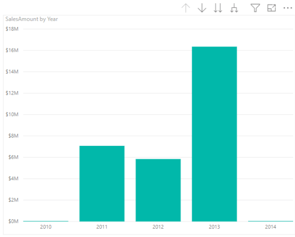
Now that we’ve learned how to drill down in a matrix table, let’s see how to drill down in a visualization. Highlight the matrix that we used in days twenty and twenty-one and select the Stacked Column Chart in the visualization menu. This will convert our matrix table to the stacked column chart using the same selected fields OrderDate and SalesAmount as shown in Figure 1.
This is the same data now represented as a chart. If we right click on one of the stacks, as shown in Figure 2, we see a Drill Down option. Notice that there is also a Show Next Level and Expand to Next Level options.
- If we choose Drill Down it takes us to Sales Amount by Year and Quarter and in this case it is 2013.
- If we choose Show Next Level, it takes us to Sales Amount by Quarter. This is an aggregation for all years by quarter. There is a difference here between seeing a drill down into 2013 data and looking at the next level of the hierarchy.
- If we choose Expand to Next Level, as shown in Figure 3, we see a break-down by year and quarter for Sales Amount.
These are subtle differences but very important differences. We can continue drilling up or down to see the various levels for this chart in much the same way that we did for the matrix table. Note that the up and down arrows are available above the visualization here as well. Stay tuned for the drillthrough in our next installment.


