30 Days to Success in Power BI: Day Eleven Adding a Second Visual
Welcome back to day eleven of our thirty-day series on Success in Power BI! Need to refresh where we left off from day ten? If so, here is the link. Today we are going to add a second visual to our page.
In order to do that, we need to add another column as these statistics track hits (H), doubles (2B), triples (3B), and home runs (HR) but they do not track singles (1B). I’ve often wondered why when you are looking at a player statistics, the single was relegated as pedestrian to not be depicted in its own column. However, we are going to give it its proper due.
- Go to the data pane on the left hand ribbon.
- Right click somewhere in the data and select Add Column. I wanted to point out that you can skip step one by right clicking on the Fields pane on the right hand side and simply choose Add Column there as well.
- Replace ‘Column =’ with the following (as shown in Figure 1): 1B = ‘Standard Batting'[H] – ‘Standard Batting'[2B] – ‘Standard Batting'[3B] – ‘Standard Batting'[HR]
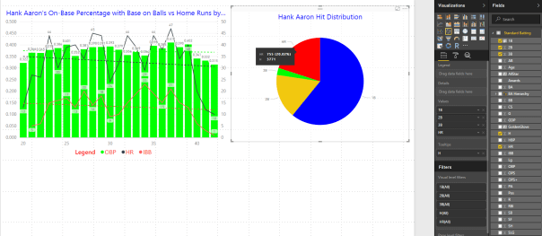
Now we are prepared to create a pie chart, but first we must make some room and size down our existing visualization on the page leaving some white space. Click on the white space so that our existing visual is not selected so when we click on the Pie Chart visualization it adds a new visual and does not change our existing line and clustered column chart to a pie chart. Click on the Pie Chart in the Visualization pane as shown in figure 2 with the red arrow.
If you notice under the Visualization pane, we have a blank canvas with no fields dragged into fill the pie chart. Select the singles (1B), doubles (2B), triples (3B), and home runs in the Fields pane on the right hand side. This will insert them as values and populate our pie chart as shown in Figure 2. Note that I’ve already made it a little prettier with a change in colors and title. I’ve also added hits (H) to the Tooltips section so that when you hover over home runs for example you can also see how many total hits for example. The hover automagically adds a percentage so it is nice to see what the percentage was based upon.
Notice the white space I left at the bottom, that is for tomorrow’s post. Stay tuned!
Posted on March 8, 2017, in Business Intelligence, PowerBI and tagged PowerBI. Bookmark the permalink. 2 Comments.


Pingback: 30 Days to Success in Power BI: Day Twelve Adding a Slicer | SQL Swampland
Pingback: 30 Days to Success in Power BI | SQL Swampland