30 Days to Success in Power BI: Day Eight Adding More Analytics
Welcome back to day eight of our 30 day series on Success in Power BI! Have you forgotten where we left off from day seven? If so, here is the link to refresh your memory. Let’s remove the Max and Min lines that we added on day seven and add some different analytics to our visual. You should be starting like Figure 1.

Figure 1 – Reset the Area Chart
In the Analytics pane, add a Trend Line as shown in Figure 2. Notice that it inserts a dashed black line, but even more interesting is that it defaults a setting called Combine Series to On. In essence, we are seeing a trend line for both the on-base percentage and the batting average. It is as we would expect with a player aging, his performance trends downward. Change the default for Combine Series to Off and let’s see how it changes our story.
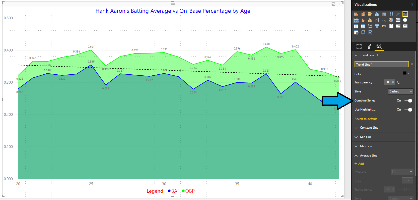
Figure 2 – Combined Trend Line
Now we have TWO trend lines as shown in Figure 3, one for OBP and one for BA. In addition, they are defaulted to the colors of the original lines but these are dashed for delineation: Automagically!!! Now when we compare those two sets of trend lines (Figures 2 and 3) you should see a different slope. The on-base percentage was more flat and consistent while the batting average dropped more rapidly than the combined line. That is fascinating and it shows that even as he aged he was still consistently able to get on base. Being a home run hitter, some of that was attributed to more walks as pitchers would rather give up an intentional walk than a home run especially with runners on base. Let’s look at that in a future day. Changing this setting altered our story and gave us more insight than a combined trend line. It may not always.
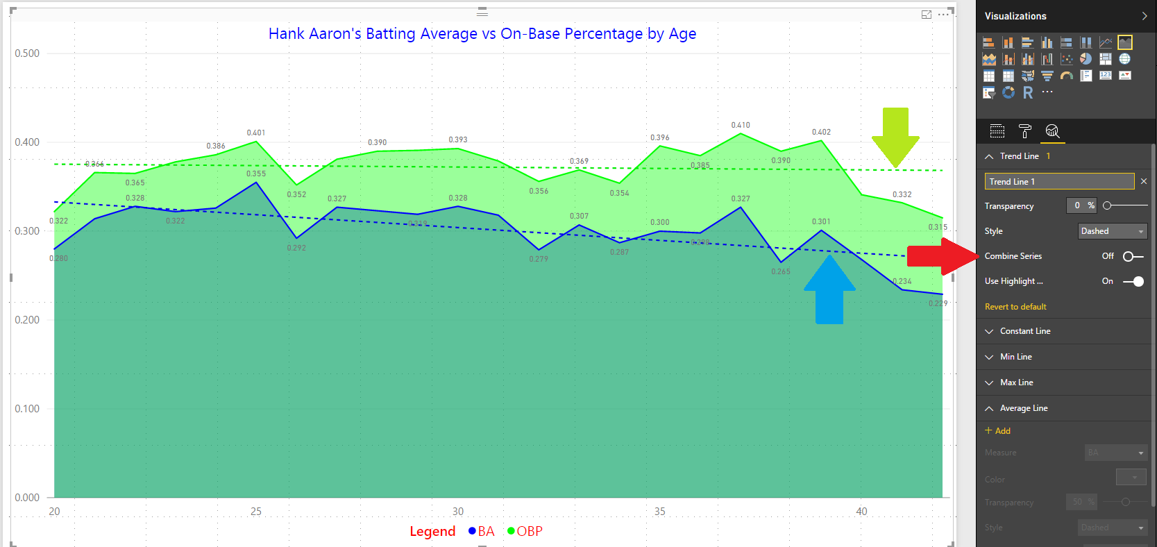
Figure 3 – Separate Trend Lines
What else can we do as far as analytics are concerned? Well…we can also add Average Lines, Median Lines, and Percentile Lines. Give them all a try to see what the differences are. But, a click or two and you have added instant analytics in your visuals. Pretty nifty, huh? Stay tuned for more Power BI!
Posted on March 3, 2017, in Business Intelligence, PowerBI and tagged PowerBI. Bookmark the permalink. 2 Comments.


Pingback: 30 Days to Success in Power BI | SQL Swampland
Pingback: 30 Days to Success in Power BI: Day Nine Line and Clustered Column Chart | SQL Swampland