Monthly Archives: August 2018
30 Days to Success in Power BI: Day Twenty-Four Themes
Welcome back to day twenty-four of our thirty-day series on Success in Power BI! Have you forgotten where we left off from day twenty-three? If so, here is the link to refresh your memory.
When Power BI first debuted, one of the features that it lacked was the ability to change a color scheme on a wholesale basis. At that point (and still today) you can change colors for individual data points and that can be tedious with a lot of data points and/or trying to match up corporate color schemes or with existing corporate SSRS reporting standards. With the advent of Themes in Power BI, you can change a color theme for an entire report easily and quickly and copy that into your next report.
There is one important caveat if you have existing reports: If you have modified all of the colors in a report, implementing a Theme will not change the existing color scheme in a report as you’ve customized those colors already and the theme will not change that. This could be considered a feature or a bug depending upon your perspective. Microsoft considers that a feature. Plan accordingly.
The color themes are simple JSON files that look like the following (this one we created at the following site https://powerbi.tips/tools/advanced-color-theme-generator/):
{
	"name": "MyTheme",
	"dataColors": [
		"#121a56",
		"#2337c7",
		"#23abc7",
		"#23c77b",
		"#23c730",
		"#c423c7",
		"#c73223"
	],
	"background": "#c7c423",
	"foreground": "#b223c7",
	"tableAccent": "#0b090c"
}
In order to change themes, we select the Switch Theme button on the main ribbon, as shown in Figure 1. Power BI gives us a few provided options. We can also download themes from the Microsoft Power BI community.

Figure 1 – Themes
Here we have returned to our Hank Aaron data and reports from earlier in the series. The colors in Figure 2 are before we apply any theme. We could use the JSON file that I created above to get a new color theme.
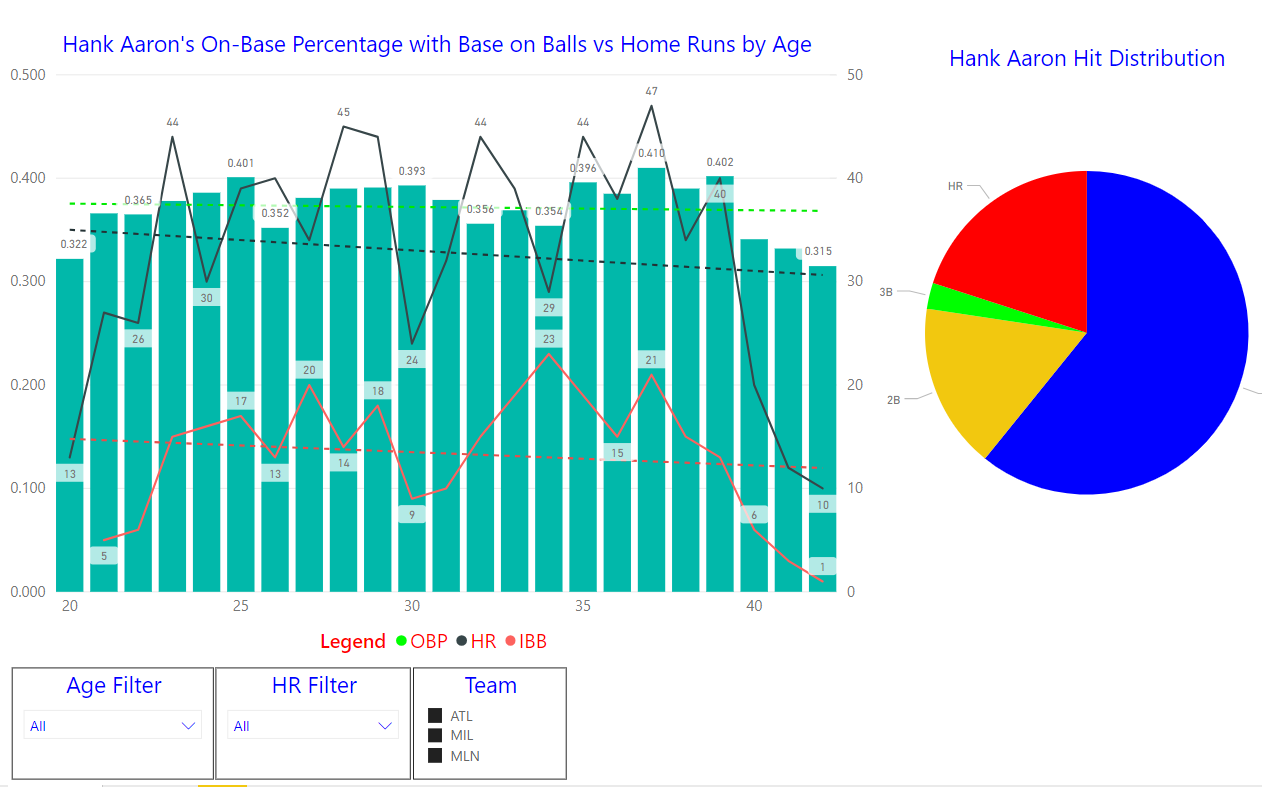
Figure 2 – Before Theme
After choosing Import Theme from the Switch Theme ribbon, we chose our manually created JSON file to produce the following hideous report shown in Figure 3. Notice that some colors such as in the pie chart never changed. We covered that earlier, they will not change as they’ve been customized. We probably should have created a corporate color scheme or gone with one of the provided themes. as this looks horrible. Have fun with your color themes, but not this much fun. Stay tuned!
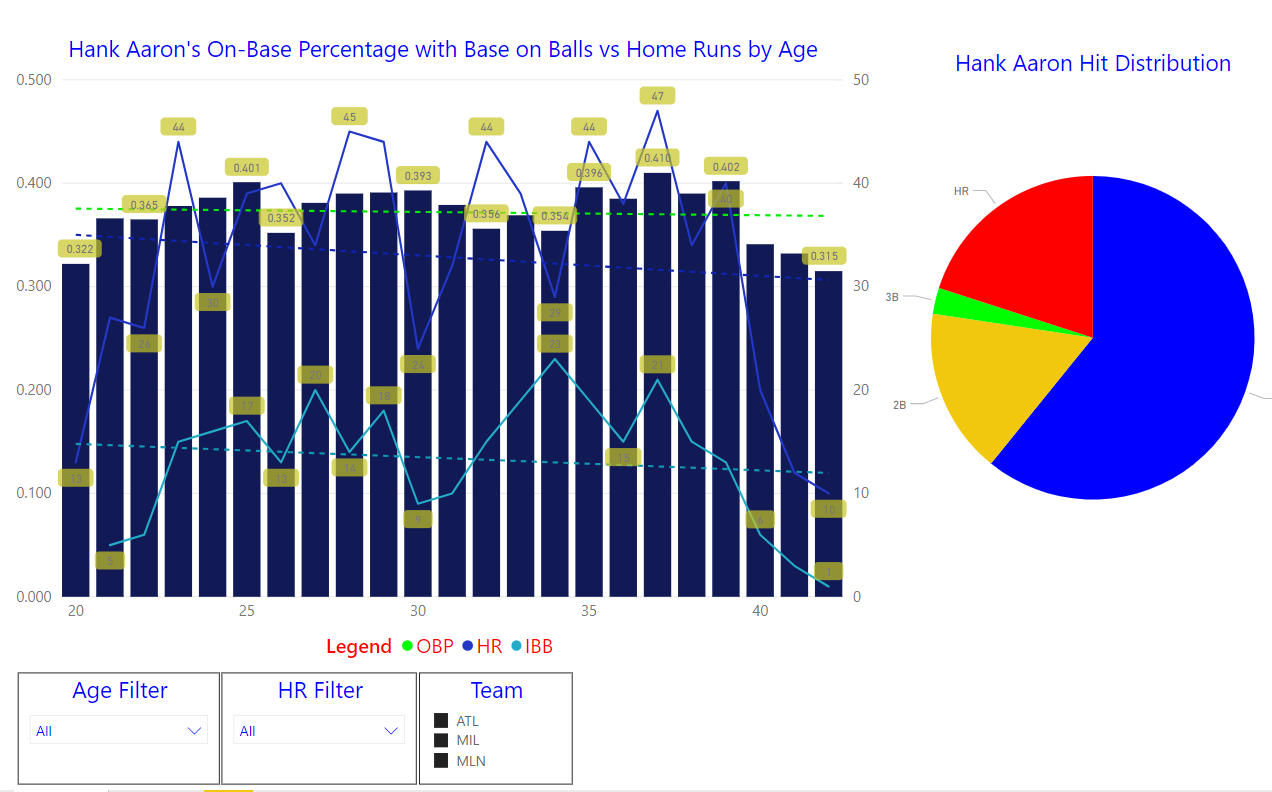
Figure 3 – After Theme


