30 Days to Success in Power BI: Day Five Making It Pretty
Welcome back to day five of our series on Success in Power BI! With 30 days of Power BI learning, we should be able to be successful with our use of the desktop tool. Have you forgotten where we left off from day four? If so, here is the link to refresh your memory.
So for today let’s tidy up our visualization to make it a little more appealing because a polished visual is needed to give to executives, right? The first thing we are going to do is add some tooltips. These are designated fields of data that will show when you hover over data-points on the graph. Our data tells a story, so let’s add some details to tell it properly.
In Figure 1, you can see by the red arrow that we’ve dragged over the Year and the First Awards fields from the dataset. When we highlight over a data-point (as shown in the green arrow) we will get a tooltip that shows the age first (39) then the Batting Average (BA 0.30). Now, we can also see that the Year was 1973 and we can see some awards (AS, MVP-12). The original website designates these as an All Star selection year and he also finished twelfth in the Most Valuable Player award voting that particular year. That data may not be as useful in this case but it is a great addition to see that he was 39 in 1973. It helps to explain our insight a little better.

Figure 1 – Adding Tooltips Details
Now let’s cleanup the data-points for the batting averages as baseball generally sees this statistics in the thousandths places, such as batting 0.300 which is pronounced three hundred. As you can see in the Figure 1 Tooltip, it shows that he batted 0.30 which is really 0.301 and that extra one makes all the difference in the world in baseball.

Figure 2 – Format to the Thousandths Place
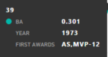
Figure 3 – Tooltip Updated
In order to get the tooltips to show three places, we need to open the dataset again as shown in Figure 2. We highlight the BA column and go to the Formatting area on the Modeling ribbon. There is a decimal control there (see red arrow in Figure 2), press up until you get to three. Notice at the blue arrow we see the average of 0.301. We can now see if we switch back to the report view and hover over the same spot, we will now see 0.301 as shown in Figure 3. But the Y-axis is still showing only two decimal places. We should correct that for consistency sake.
In the Visualizations Pane, we select the Format tool (Figure 4, blue arrow that looks like a paint roller). This brings up a formatting menu where we can change many aspects of the visualization. In this case we want to increase the font on the X-axis to 14 (Figure 4, orange arrow). Then we will do the same for the Y-axis (Figure 4, red arrow). However, we will also change the scale with the starting point being 0 and the ending point being 0.360. This will give our chart some depth and make it more linear in scale. We will also change the decimal field to three so that our axis matches the accuracy of our tooltips.

Figure 4 – Axis Clean Up
Let’s also change the color of the line graph as I really don’t like the default colors in Power BI. It reminds me too much of the cyan from the limited color scale available on my 1980’s IBM PC. If you select the Data Colors control and then change the Batting Average data to Blue by entering the #0000FF hexadecimal code or selecting blue from the custom palette as shown by the blue arrow in Figure 5. Right below there we will see the Data labels control by the red arrow. We can set that to On and now see the data points with actual labels. This feels more presentable to me.

Figure 5 – Color with Labels
Are we done yet? Not yet. This visualization needs a catchy title as you will notice in Figure 5 in the upper left hand corner a small font with a couple of words defaulted there. Let’s change that to something more visually stimulating for the end-user. If we keep scrolling down on our Formatting area, we can see the Title control. Select that control and change the title, give it a blue color, and center it as shown in Figure 6 near the blue arrow. We’ve now completed our first visualization and it looks most impressive. Good job. Stay tuned to day six!

Figure 6 – Nicer Title
Posted on February 28, 2017, in Business Intelligence, PowerBI and tagged PowerBI. Bookmark the permalink. 2 Comments.


Pingback: 30 Days to Success in Power BI: Day Six Adding More Data | SQL Swampland
Pingback: 30 Days to Success in Power BI | SQL Swampland