30 Days to Success in Power BI: Day Six Adding More Data
Welcome back to day six of our series on Success in Power BI! With 30 days of Power BI learning, we should be able to be successful with our use of the desktop tool. Have you forgotten where we left off from day five? If so, here is the link to refresh your memory.
Before we get started from where we left off, let me show you a nifty little feature in Power BI Desktop. If you select the Data / Drill tab on the ribbon menu and select the See Data button, you can see all of the data points mapped including the Tooltips data points just below the graph as seen in Figure 1.
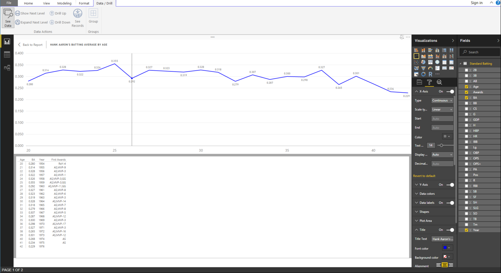
Figure 1 – Drill Data
Let’s go through some definitions to help your understanding of baseball terminology in statistics:
At Bats (AB): a statistic that counts a plate appearance only if the batter produces a hit, an out, an error, or a fielder’s choice.
Base on Balls or Walk (BB): when a pitcher throws four balls and the batter is subsequently awarded first base.
Batting Average (BA): a statistic that is defined by the number of hits divided by the number of at bats.
Hit (H): a statistic where the batter safely reaches first base without an error or fielder’s choice.
Hit By Pitch (HBP): this occurs when a pitcher hits the batter with the ball and he is awarded first base.
On-Base Percentage (OBP): a statistics defined by the sum of hits, walks, and hit by pitches divided by the sum of at bats, walks or base on balls, hit by pitches, and sacrifice fly balls. In other words: OBP = (H + BB + HBP) / (AB + BB + HBP + SF)
We went through that exercise to help you understand the difference between batting average and on-base percentage. These are two of the main statistical comparison points for offense in baseball. Therefore,we will now add the OBP field to the graph. We can drag that from the Fields pane on the left to the Values slot in just to the right of there as shown in Figure 2. Theoretically, OBP should always be greater than BA because batters can get on base for more than just a hit, as shown above in the definitions.
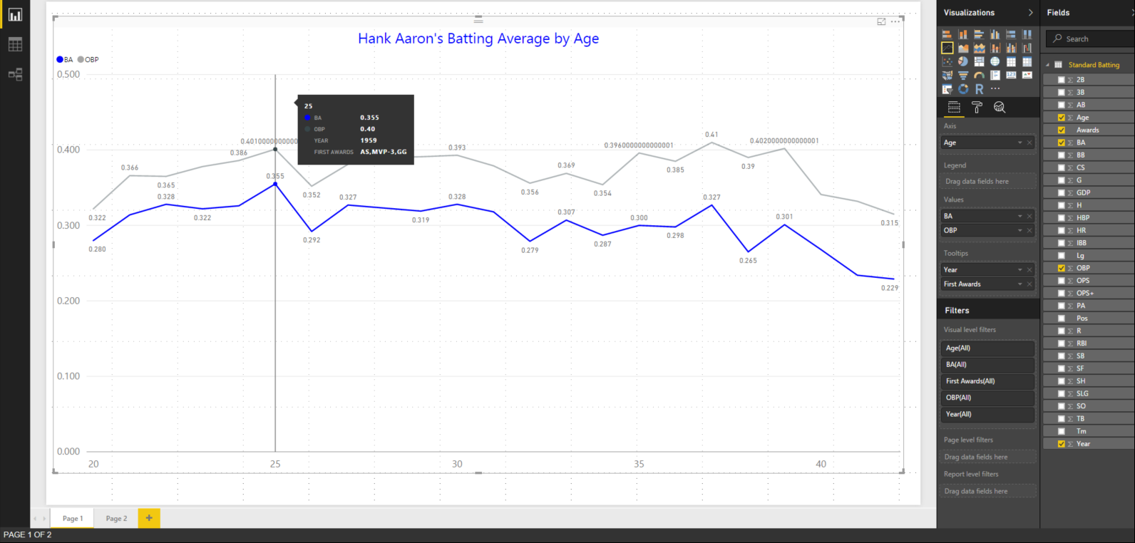
Figure 2 – Adding On-Base Percentage (OBP) to the Visualization
Let’s make some formatting changes to clean up our addition. First, let’s change the title to reflect our added data as sown in Figure 3 with the blue arrow. Now, we can change the OBP line to green as shown with the green arrow so that in stands out in comparison to the blue of the BA. Now let’s add a legend, place it in the bottom center, increase the font size, and color it red as shown with the red arrow. We are fast becoming pros at Power BI. Did we miss anything? Take a good look.

Figure 3 – New Formatting
Did you see it? The data labels are showing some crazy decimal places. Let’s tidy that up too! Go back into the dataset and change the formatting from Auto to three decimal places for OBP as shown in Figure 4. We should go ahead and do the same for SLG and OPS while we are in there in case we want to graph them later. We did this in day five for batting average.
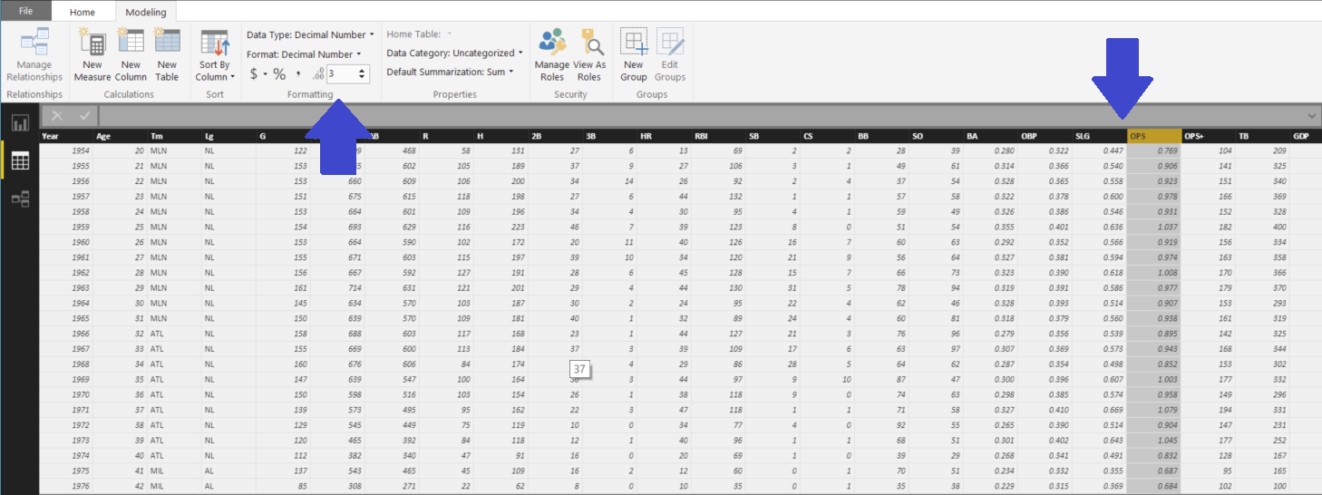
Figure 4 – Clean Up OBP, SLG, and OPS
Here in Figure 5 we see the finished product. A visualization that we can be proud of. Stay tuned tomorrow to see where we go next!
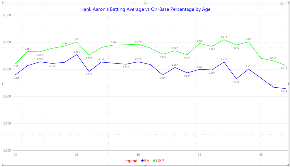
Figure 5 – Finished Visual
Posted on March 1, 2017, in Business Intelligence, PowerBI and tagged PowerBI. Bookmark the permalink. 2 Comments.


Pingback: 30 Days to Success in Power BI | SQL Swampland
Pingback: 30 Days to Success in Power BI: Day Seven Adding Simple Analytics | SQL Swampland