30 Days to Success in Power BI: Day Seven Adding Simple Analytics
Welcome back to day seven of our series on Success in Power BI! With 30 days of Power BI learning, we should be able to be successful with our use of the desktop tool. Have you forgotten where we left off from day six? If so, here is the link to refresh your memory.
What more can we do with our visualization? What if we do not like the Line Chart visual? If you select the Area Chart visual you can quickly change your visual to the graph shown in Figure 1.
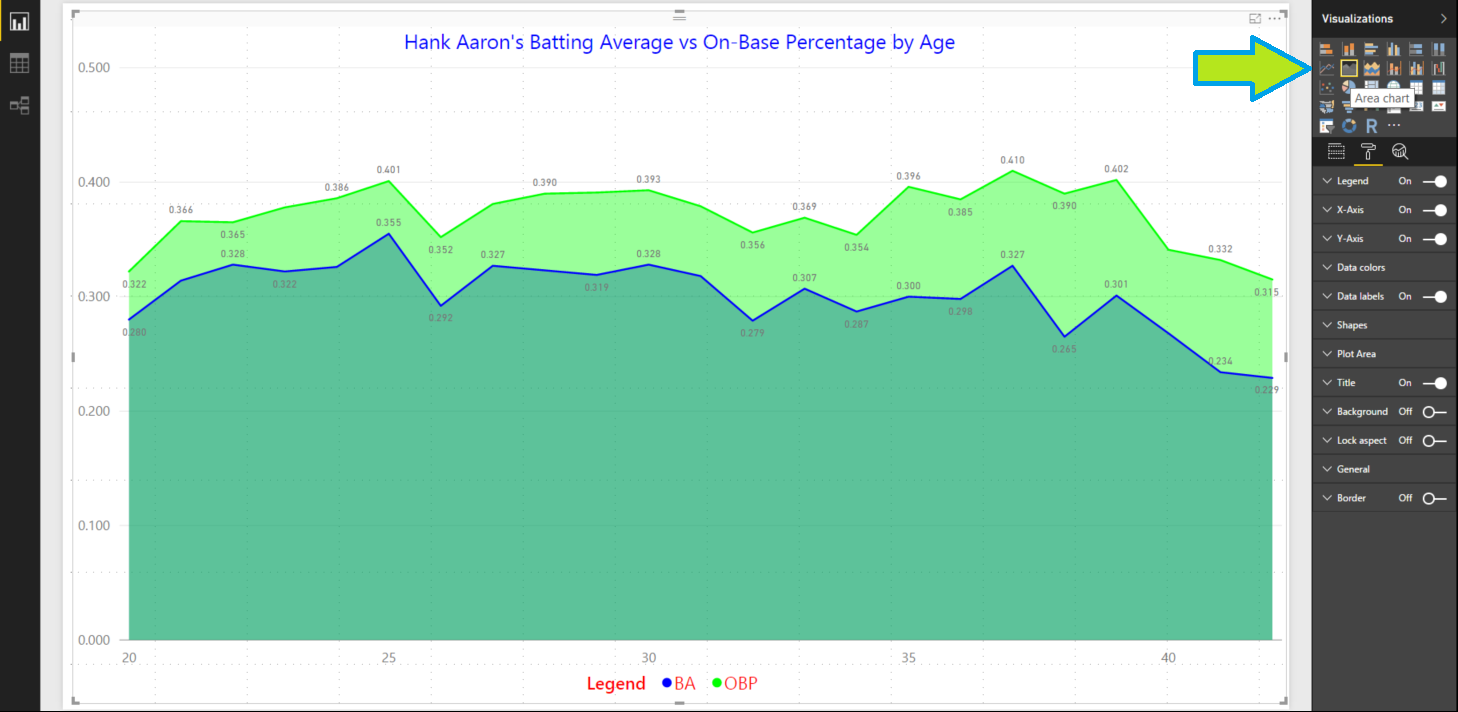
Figure 1 – Easily Switched to an Area Chart
Try some other visuals. Better yet, try them all. Personally, I do not think any of the other visuals work with this set of selected values. For example, in Figure 2 we see a Clustered Column Chart which to me isn’t as easy to see the natural trend line but it works. I think the original Area Chart works best in this scenario. Let’s switch back to that visual moving forward.
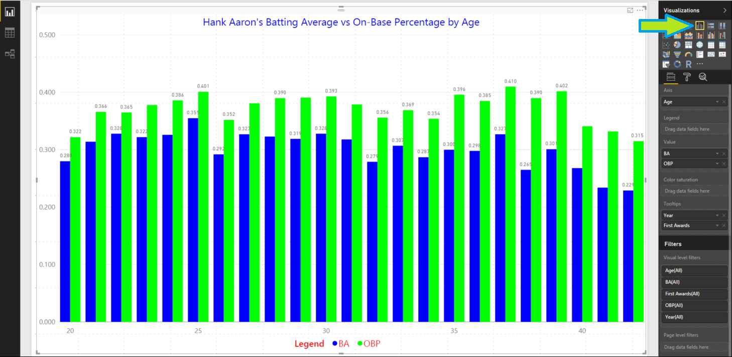
Figure 2 – Clustered Column Chart
Speaking of trend lines, let’s add some simple analytics such as a Min and Max line. We can easily add a Min line for the BA and the OBP. Select the third icon in the pane below the Visualizations called Analytics as shown in Figure 3 with the red arrow. Select Min Line and add two Min Lines and configure them as shown with the blue arrows. We need the colors and alignment to show in our area chart. For batting average, I used a bright yellow line and for on-base percentage a red. I then used a black font and moved it to the right and under the line. If the colors are hard to see you could switch back to a regular line chart to prevent the color clash.

Figure 3 – Adding Min Lines
Now we can do the same to add in some Max Lines using straight lines with the same respective color for either OBP or BA as showing in Figure 4. I changed these to be solid lines to avoid confusion. The visual is sort of busy but it works, right? Maybe the color choices are not perfect and those can always be tweaked. But we’ve added some base analytics to our visual. We are rock stars, right? Stay tuned for more.
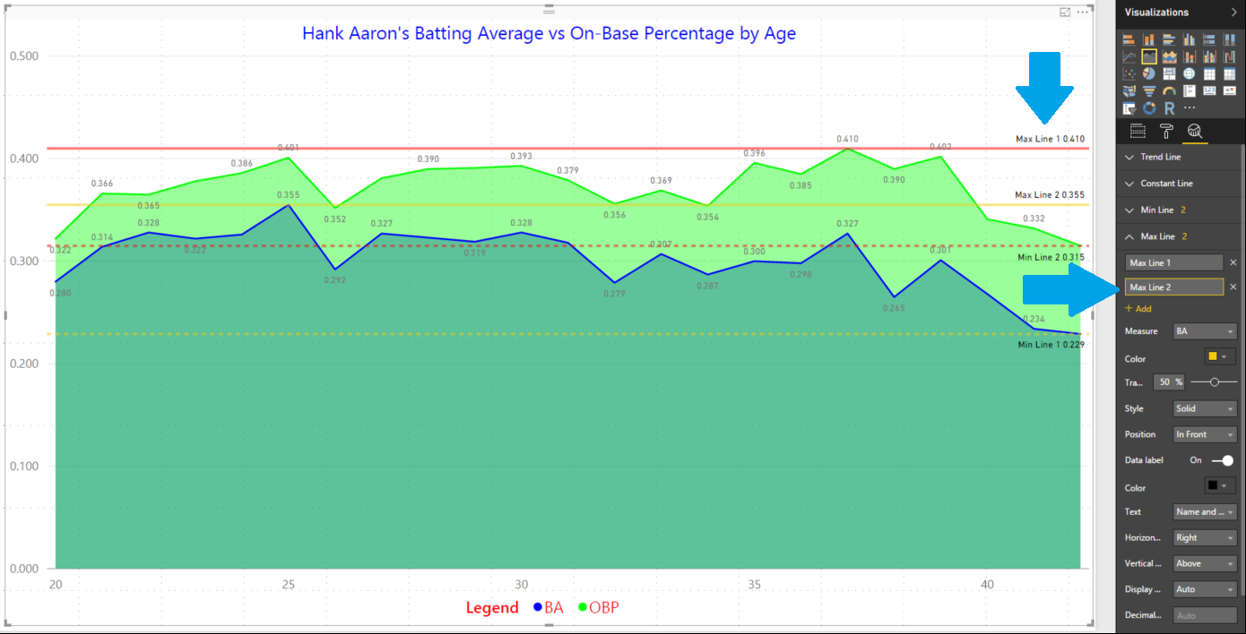
Figure 4 – Adding Max Lines
Posted on March 2, 2017, in Business Intelligence, PowerBI and tagged PowerBI. Bookmark the permalink. 2 Comments.


Pingback: 30 Days to Success in Power BI | SQL Swampland
Pingback: 30 Days to Success in Power BI: Day Eight Adding More Analytics | SQL Swampland