30 Days to Success in Power BI: Day Nine Line and Clustered Column Chart
Welcome back to day nine of our thirty-day series on achieving Success in Power BI! Have you forgotten where we left off from day eight? If so, here is the link to refresh your memory.
Yesterday we made an assertion about Hank Aaron’s on-base percentage (OBP) remaining fairly flat over his career that could have been caused by more walks as a result of him being a home run hitter. This is a common strategy in baseball where the pitcher will walk a home run hitter to prevent a home run when there are runners on base. We should test that theory using our data! Change your visual to the Line and clustered column chart in the Visualizations pane. Your visual should appear like Figure 1.

Figure 1 – Clustered Column Chart with Trends
Now remove the batting average (BA) field from the Column values to avoid confusion as we want to see if walks (BB) correlate with on-base percentages (OB) and home runs (HR) for Hank Aaron. First off, let’s change the title to something a little more reflective of our comparison. Then, add the BB field to the Line values as depicted by the black arrow in Figure 2. Also, notice that a trend line was added for these in a dashed version of the color used to depict the walk line.
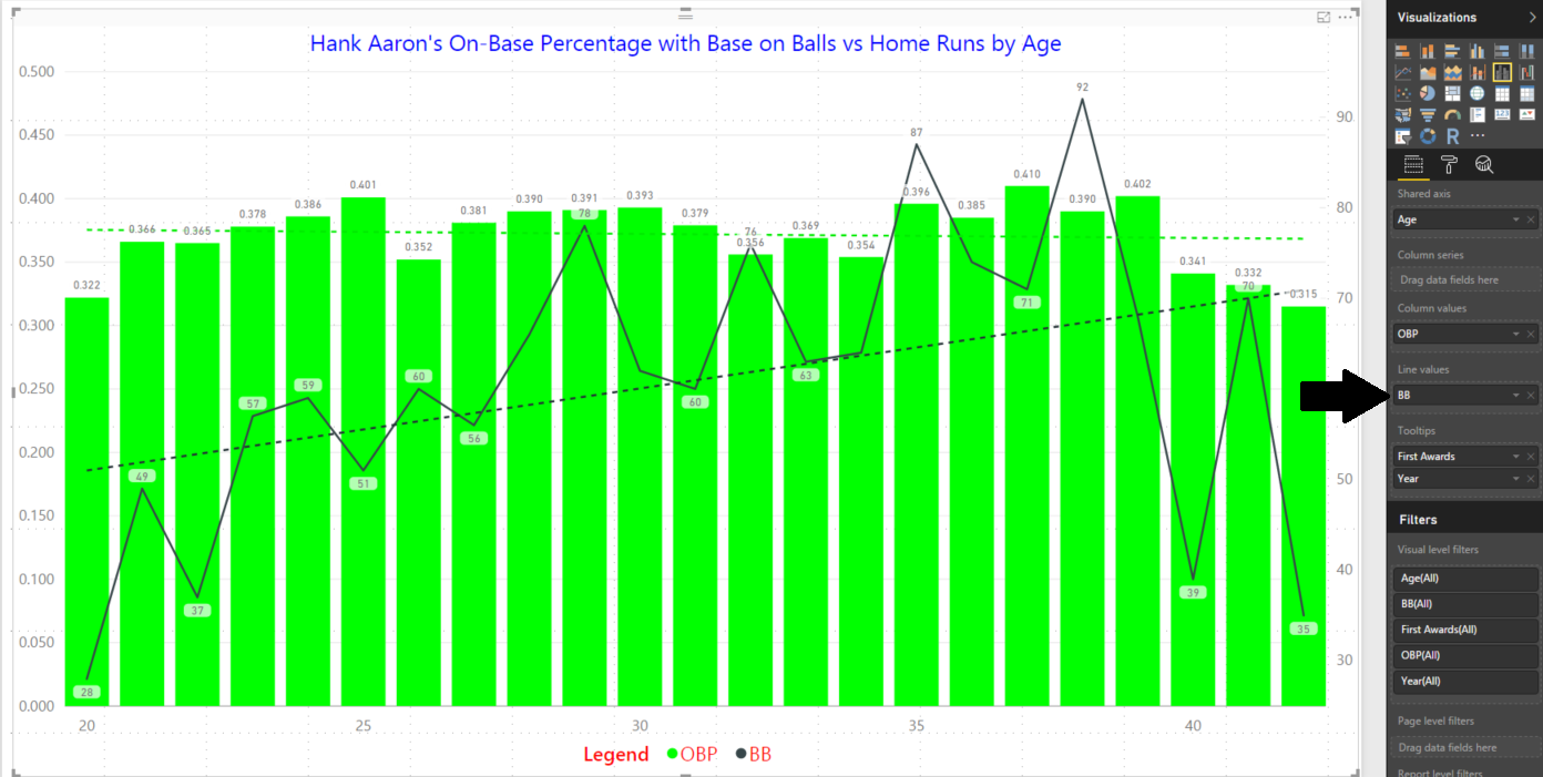
Figure 2 – Adding the Walk Line
Now we will add the home run (HR) field to the Line values area as shown with the red arrow in Figure 3. It is interesting to note that according to the trend line, Aaron’s walks (BB) increased as he got older yet the home runs (HR) decreased, as we would have expected with a declining physical stature. It also doesn’t appear that there is a correlation to walks (BB) versus home runs (HR), at least not a strong one.

Figure 3 – Adding Home Runs
Lucky for us that in 1955 Major League Baseball began tracking intentional walks (IBB) as those were more related to a home run hitter’s prowess. Regular walks could be from poor pitching and were not necessarily intended to pitch around a good hitter. The distinction is important to show correlation in this theory. Also, keep in mind 1955 was Aaron’s second year so we will not see data for his rookie year.
However, there still does not seem to be a correlation as some years like at age 32 he had 44 home runs and only 15 intentional walks and his on-base percentage was lower than most other years despite being a strong home run performance year. Likewise two years later his home run total dropped to 29 but his intentional walks spiked to 23, the highest in his career. The trend for intentional walks does follow the home run trend downward.
Does this data give us an accurate analysis? If we were presenting this to the board with a couple of visualizations that we’ve created, would they make an informed decision? Would you? Stay tuned!

Figure 4 – Replacing Walks with Intentional Walks
Posted on March 6, 2017, in Business Intelligence, PowerBI and tagged PowerBI. Bookmark the permalink. 2 Comments.


Pingback: 30 Days to Success in Power BI: Day Ten Add New Calculated Columns | SQL Swampland
Pingback: 30 Days to Success in Power BI | SQL Swampland