Monthly Archives: October 2017
30 Days to Success in Power BI: Day Nineteen Take Power BI to Another Level
Welcome back to day nineteen of our thirty-day series on Success in Power BI! Have you forgotten where we left off from day eighteen? If so, here is the link to refresh your memory.
For the next few blog posts we are going to discuss taking Power BI to another level. We are going to discuss drill down (or up) and drillthrough.
Let’s explain the terminology first!
With drill down, we can go from a high level on a report like Year to Date Sales to the lowest detail that we wish to show. We can decide how many levels of drilling. So let’s say our first level is corporate-wide so we might see one row for 2017 that has sales data totals for the entire corporation. If we drill down to the next level, we can see that inside the corporation we now have totals by global regions. If we drill down a little further we might see totals by country and then totals by smaller regions and so on. Drilling up is simply going back up that chain. This adds an entirely new dimension to our reports that eliminates the need for multiple static reports.
Drillthrough, on the other hand, provides the ability to drill through to another page or report for detail and thus filter by the field that you selected when you chose drillthrough. For example, when we have our drill down and we get to the country detail on our report mentioned above, we could drillthrough to a second report that shows sales details and it would then filter by that country.
If this sounds a little confusing, do not fret…we will go through it in the next couple of posts. Stay Tuned!
30 Days to Success in Power BI: Day Eighteen Choosing the Right Visual
Welcome back to day eighteen of our thirty-day series on Success in Power BI! Have you forgotten where we left off from day seventeen? If so, here is the link to refresh your memory.
Let’s look at visuals today. The hardest part to designing a Power BI report is deciding which visuals to use that will best convey the message of your report or dashboard. I could go into a detailed analysis of each of the default visuals, but a few days ago I came upon the following visual reference from SQLBI.com (which is an excellent and highly recommended Power BI reference site) and thought I would pass it along instead of reinventing the wheel:
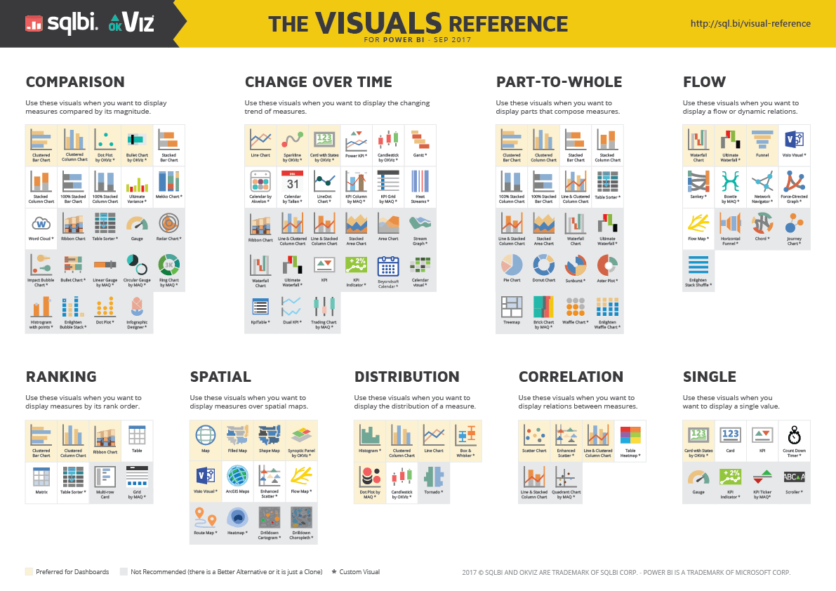
The page where the image was found (http://www.sqlbi.com/ref/power-bi-visuals-reference/) has a download option for the PDF for your daily use. Enjoy!


