Monthly Archives: May 2017
30 Days to Success in Power BI: Day Sixteen Data Insights
Welcome back to day sixteen of our thirty-day series on Success in Power BI! Have you forgotten where we left off from day fifteen? If so, here is the link to refresh your memory.
Now that we’ve uploaded our report to PowerBI.com, we can take advantage of a neat little feature called Quick Insights. From the Reports screen, select the light bulb icon and generate the insights as shown in Figure 1.
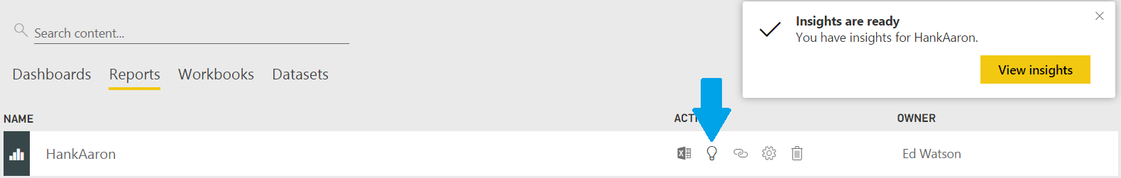
Figure 1 – Quick Insights
This generates some helpful and interesting insights from our dataset. However, some of them might be useless because we know our data and might lead to a “buyer beware” situation. In addition, some of them are obvious to baseball fans, such as Figure 2, but with your data maybe you want a correlation pointed out in the data. We generally know that the more games you play, the more plate appearances you should have. But now we have data to back up the correlation!

Figure 2 – Correlation between Plate Appearances and Games
There were some interesting insights provided such as Figure 3. The tool found a correlation between walks (BB) and age for a certain subset of data: when Hank Aaron played for the Milwaukee Braves. Is that because he became a better, more patient hitter?

Figure 3 – Correlation Between Age and Walks (BB)
In Figure 4, we have an additional correlation, between Strike Outs and Walks (BB) for the Milwaukee Braves. Fascinating!

Figure 4 – Correlation Between Walks and Strike Outs
Keep in mind that there were many insights generated for our data set. Many of them were not useful in this example such as the number of times Hank was caught stealing by the position he played. Because we know the data, there really is not a useful need for this relationship. But we get to decide which insights are useful and save those to our dashboard by clicking on the push pin icon in the upper corner. This will prompt us to select or create a new dashboard, as seen in Figure 5. We will explore dashboards further in day seventeen. Stay tuned!
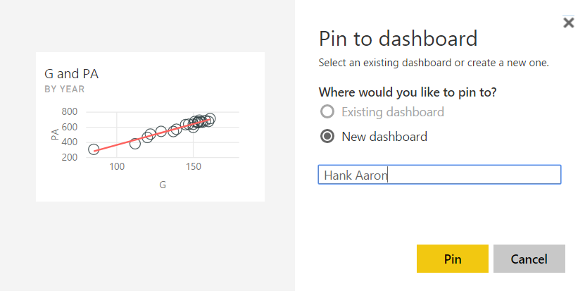
Figure 5 – Pin the Insight to a Dashboard


