Category Archives: Business Intelligence
30 Days to Success in Power BI: Day Five Making It Pretty
Welcome back to day five of our series on Success in Power BI! With 30 days of Power BI learning, we should be able to be successful with our use of the desktop tool. Have you forgotten where we left off from day four? If so, here is the link to refresh your memory.
So for today let’s tidy up our visualization to make it a little more appealing because a polished visual is needed to give to executives, right? The first thing we are going to do is add some tooltips. These are designated fields of data that will show when you hover over data-points on the graph. Our data tells a story, so let’s add some details to tell it properly.
In Figure 1, you can see by the red arrow that we’ve dragged over the Year and the First Awards fields from the dataset. When we highlight over a data-point (as shown in the green arrow) we will get a tooltip that shows the age first (39) then the Batting Average (BA 0.30). Now, we can also see that the Year was 1973 and we can see some awards (AS, MVP-12). The original website designates these as an All Star selection year and he also finished twelfth in the Most Valuable Player award voting that particular year. That data may not be as useful in this case but it is a great addition to see that he was 39 in 1973. It helps to explain our insight a little better.

Figure 1 – Adding Tooltips Details
Now let’s cleanup the data-points for the batting averages as baseball generally sees this statistics in the thousandths places, such as batting 0.300 which is pronounced three hundred. As you can see in the Figure 1 Tooltip, it shows that he batted 0.30 which is really 0.301 and that extra one makes all the difference in the world in baseball.

Figure 2 – Format to the Thousandths Place
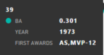
Figure 3 – Tooltip Updated
In order to get the tooltips to show three places, we need to open the dataset again as shown in Figure 2. We highlight the BA column and go to the Formatting area on the Modeling ribbon. There is a decimal control there (see red arrow in Figure 2), press up until you get to three. Notice at the blue arrow we see the average of 0.301. We can now see if we switch back to the report view and hover over the same spot, we will now see 0.301 as shown in Figure 3. But the Y-axis is still showing only two decimal places. We should correct that for consistency sake.
In the Visualizations Pane, we select the Format tool (Figure 4, blue arrow that looks like a paint roller). This brings up a formatting menu where we can change many aspects of the visualization. In this case we want to increase the font on the X-axis to 14 (Figure 4, orange arrow). Then we will do the same for the Y-axis (Figure 4, red arrow). However, we will also change the scale with the starting point being 0 and the ending point being 0.360. This will give our chart some depth and make it more linear in scale. We will also change the decimal field to three so that our axis matches the accuracy of our tooltips.

Figure 4 – Axis Clean Up
Let’s also change the color of the line graph as I really don’t like the default colors in Power BI. It reminds me too much of the cyan from the limited color scale available on my 1980’s IBM PC. If you select the Data Colors control and then change the Batting Average data to Blue by entering the #0000FF hexadecimal code or selecting blue from the custom palette as shown by the blue arrow in Figure 5. Right below there we will see the Data labels control by the red arrow. We can set that to On and now see the data points with actual labels. This feels more presentable to me.

Figure 5 – Color with Labels
Are we done yet? Not yet. This visualization needs a catchy title as you will notice in Figure 5 in the upper left hand corner a small font with a couple of words defaulted there. Let’s change that to something more visually stimulating for the end-user. If we keep scrolling down on our Formatting area, we can see the Title control. Select that control and change the title, give it a blue color, and center it as shown in Figure 6 near the blue arrow. We’ve now completed our first visualization and it looks most impressive. Good job. Stay tuned to day six!

Figure 6 – Nicer Title
30 Days to Success in Power BI: Day Four Our First Visualization
Welcome back to day four of our series on Success in Power BI! With 30 days of Power BI learning, we should be able to be successful with our use of the desktop tool. Have you forgotten where we left off from day three? If so, here is the link to refresh your memory.
So let’s create a visualization today in Power BI. For clarity’s sake, the Power BI desktop consists of reports, visualizations, and datasets. We’ve already built a dataset in the previous couple of days. Now, there is a difference between reports and visualizations. A visualization might be a pie chart or a map. A report, however, can contain one or many visualizations in order to present your data insight. Therefore it might contain a pie chart and a map to present the data cohesively in order to understand the insight we are presenting. Make sense?
So let’s get started. If you look at Figure 1, you’ll see the red arrow pointing to the available visualizations. You’ll also see where I clicked on the ellipses icon in the bottom right area and brought up a menu to import visuals (another name for visualizations). I am mentioning this to let you know that you can download custom visualizations!! Some are pretty fun and create memorable visuals for your intended audience. You can download these at https://app.powerbi.com/visuals/ and install them on your Power BI Desktop installation. For our purposes, however, we will stick with the standard visuals for now until we get up and running.

Figure 1 – Visualizations
The first step to creating a visualization on our blank canvas is to choose one from the Visualizations area (highlighted in Figure 1) and click on it. We are going to select the Line Chart visual which is highlight in Figure 2 (first on the left of the second row from the top). This will drop a blank line chart visual onto your page as shown in Figure 2 on our white page.

Figure 2 – Line Chart Starting Point
Now you can see the dark area (called Fields and Filter pane) below the visualizations has changed between Figure 1 and Figure 2, depending upon the visual that was selected. This is probably the most difficult part of Power BI, in my opinion, as these titles do not seem very intuitive to the lay person (nor me the data professional, lol).
For this line chart, we want to see Hank Aaron’s batting average by his Age as players’ performance tends to decline as they age (as do all of us eventually). So if you look to the far right, you can see our data set fields. From here we can drag the batting average (depicted as BA) field over to the Values slot and then the Age field to the Axis slot. We will now see hit batting average on the Y axis and the age across the X axis as shown in Figure 3.

Figure 3 – Line Chart Configured
Obviously, we cannot see this visual so let’s grab the bottom corner and drag it across the page as shown in Figure 4. Not sure if you have the data in the right slots? Try different configurations to see if this is the insight you are trying to communicate. I tried reversing these and it made no sense in this situation. We really want to see an increase or decrease as the player ages.

Figure 4 – Line Chart Expanded
So now if you look at Figure 5, this is what we saw on the original web page for Hank Aaron’s major league batting statistics from Baseball-Reference.com. We have now taken our batting dataset and turned it into a workable visual. It’s not pretty. Yet. This is a great stopping point. See you on day five!

Figure 5- Batting Web View

30 Days to Success in Power BI: Day Three General Housekeeping

Figure 1 – Renaming Table 2
Welcome back to day three of our series on Success in Power BI! With 30 days of Power BI learning, we should be able to be successful with our use of the tool. Did you forget where we left off on day two? If so, here is the link to refresh your memory.
Today we are going to do some general housekeeping to get ready to use the data we loaded. This will help us understand Power BI desktop a little better and get us ready to create some amazing visualizations.
If you remember yesterday we clicked on the data icon on the left toolbar and then we could view our data set that we loaded from the web source. To avoid any confusion when or if we load more data, let’s first change that name of the table. We are going to rename Table 2 to Standard Batting, as it was labeled on the website.
Now we need to do a cursory check of the data. It is important to make sure the data loaded is the data that we want to report off of and also to ensure that there were no errors from some questionable web programming.
If you look at Figure 2, you’ll see we have two rows at the top for years 1952 and 1953. Those are for the minor leagues. We do not want those included in our visualizations as we are comparing Hank’s professional career and it is a generally accepted practice to include only major league statistics in that comparison due to the breadth and level of competition.

Figure 2 – Batting Data View
So now if you look at Figure 3, this is what we saw on the web page for Hank Aaron’s major league batting statistics and what we thought we were loading originally. The website, Baseball-Reference.com, is using some programming to hide minor league stats (as you can see a button called Show Minors). We might not have noticed this, but its an import step to note when loading data from web sources.
Figure 3 – Batting Web View
So we need to remove those rows so that we can get an accurate professional representation of Aaron’s performance. Sounds easy, right?

Figure 4 – Delete Row or Column?
Not so fast. When we click somewhere in the grid, it highlights a column, and when we right-click to choose delete (as shown in Figure 4), it appears that the column will be deleted and not the row. Trust me, it will be the column deleted. So how do we delete the row?
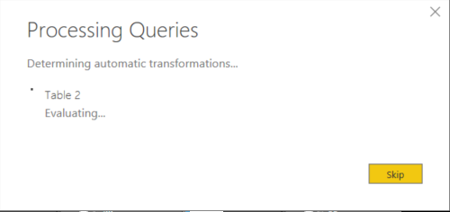
Let’s click on the Edit Queries icon on the Home toolbar (or ribbon) at the top of the screen. This will load the data into a Query Editor window (giving you two active windows). We can highlight rows here but we still cannot delete them. However, if we imagine this is Excel, then we can use the filter ability to remove our the two rows. Click on the down arrow at the column header for Year. Now deselect 1952 and 1953, as shown in Figure 5. Select Ok to make it happen captain.

Figure 5- Removing Rows
I want to point out here in Figure 6, that the rows are gone. But, I also want to point out the section on the right of the screen called Applied Steps. At this point, we have not committed any changes yet. However, this is a list of steps that we’ve done thus far in our manipulations. We can change that list or step through that list and watch the data change, if we choose.
So, if you click on the Changed Type step, you can see the two rows are there again. You can also click the delete icon (X marks the spot on the right of the step) to remove the step. Thus, if we decided to leave those two years in there and cancel out the changes that we made, we could then click the X and delete the Filtered Rows step. We could also do several other things here in the data if we needed to before applying the changes.

Figure 6 – Rows Removed
In this case, we did not really delete rows as they are filtered out just like in Excel, but they are removed from our visual data set that we will report off of. It is essentially smoke and mirrors as shown in Figure 7. This is a great stopping point. See you on day four!

Figure 7 – Smoke and Mirrors
30 Days to Success in Power BI: Day Two Loading a Web Data Source
Welcome back to day two of our series on Power BI! Are you sore from yesterday’s heavy lifting? No? Good. Did you forget where we left off? Here is the link to refresh your memory.
Today we are going to start with loading some data from a web data source. There are a ton of great data sources out there but I chose Baseball-Reference.com because of the wealth of information and statistics available there and I personally love baseball. It doesn’t matter if you are a baseball fan or not as this is just a demonstration. Feel free to find a different site for your favorite sport or activity.
Hank Aaron is generally considered to be one of the greatest baseball players of all time so we will grab some of his statistics and break them down in Power BI. With my company, Innovative Architects, being based in Atlanta, we’re pretty fond of Mr. Aaron here at the office. So let’s see where this takes us for this adventure.
Let’s start with opening Power BI. We are greeted each time with this great modal dialog box. It is a great spring board. We can open a previous project or start a new one by clicking on Get Data.

- Select Get Data to get started on our journey.
- Select Other to get to the Web data source option and select Connect.

- Select Web. Type in http://www.baseball-reference.com/players/a/aaronha01-bat.shtml and select Ok. This page will give us some lifetime stats for Hank Aaron so we can do some visualizations.

- We are now connecting to the data into Power BI.

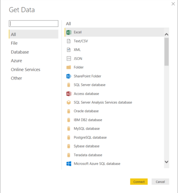
- Now the fun part: figuring out which data that we want to load. Look at all of these tables. Which one is ours?

- Let me show you a trick. Click on the Web View tab around the middle of the screen. It will show our web page data as it appears normally. However, it will also label the tables so that we know which one we want to load. Snazzy, huh?
- From here we can click on the Table 2 check box near the Standard Batting title for the table. That was much easier, huh? Select the Load button and Power BI will now start to load the data into the tool.

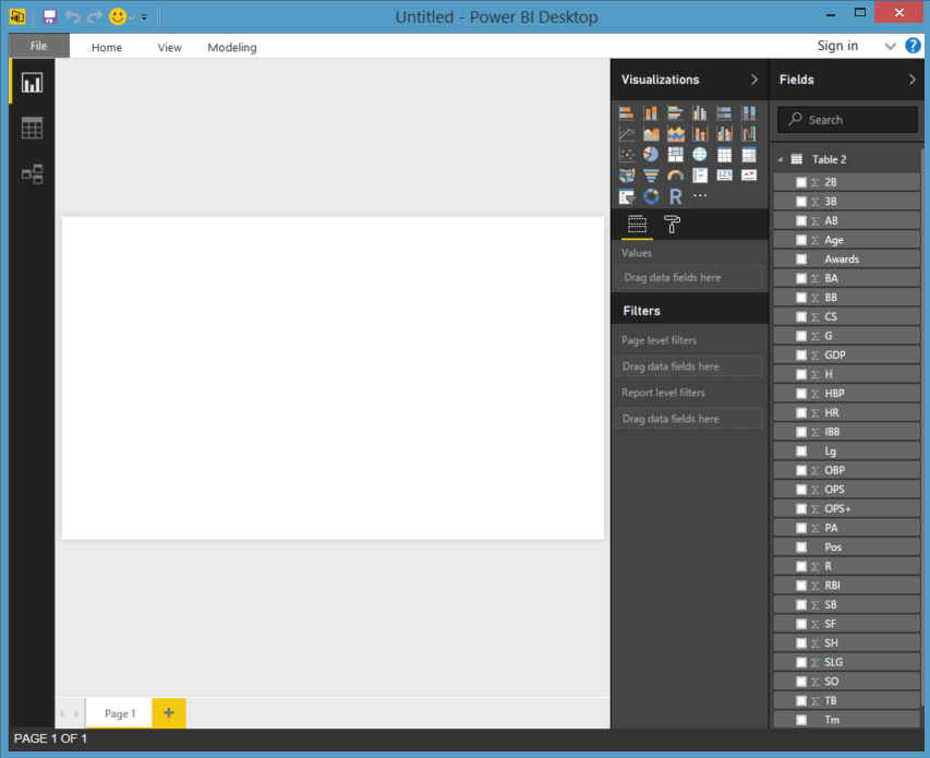
- When that completes, we will actually have data loaded into Power BI to begin our work. If you look at table 2 on the right, you can see all of the columns that we saw on the web page.

- If we click on the data icon in the middle of the three icons on the right hand side of the screen, we can actually see the data. The other two show the report and the relationships between tables. We will get into that later on.

- Let’s Save the File as Hank Aaron and pick up again on Day Three. Good job! We are data visualization gods, right?


30 Days to Success in Power BI
In the SQL Server community, I’ve seen quite a few 30 day blogs. I love the format with the idea being that you read the blog once a day for a month to master a new skill. Let’s go on adventure to learn PowerBI!
PowerBI is the latest Microsoft Business Intelligence tool. This tool, however, is considered a self-service tool in that it lets users create the data visualizations that they want to see instead of waiting for your in-house report writers to create a report for you. Excited yet? Don’t worry, you will be. It is a fun tool. Let’s get started.
Recently, I completed my first PowerBI project for a client of ours at Innovative Architects. It only took a couple of days to deliver multiple dashboards and they were beautiful if I do say so myself. This project inspired me to blog about getting started with PowerBI.
So day one needs to be getting PowerBI installed and ready to go. The first thing we do is to download the software at https://powerbi.microsoft.com/en-us/get-started/ using an email address. This is important because PowerBI is getting monthly updates and the tool is adding features every month. You really want to know about them as they are released.
- Let’s start the installer and get this party going!
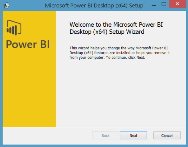
Figure 1: Basic Installer Starting Point
- Strait forward so far, right? Click Next.
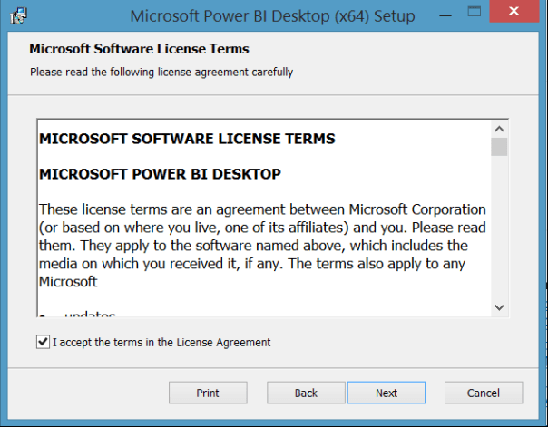
Figure 2: Basic License Acceptance Screen
- Check the acceptance box and then click Next.

Figure 3: Choose an Installation Folder
- Choose an installation folder by clicking Change or click Next to continue with the default location.
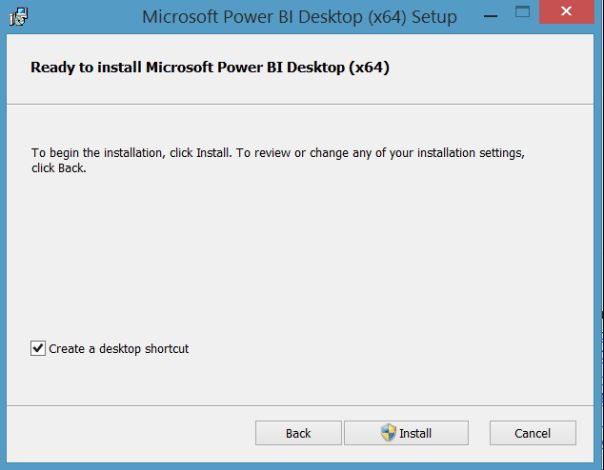
Figure 4: Let’s Install Now!!
- Click Install to begin.
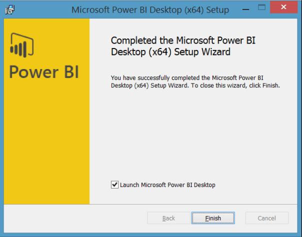
Figure 5: We’re Done!
- Click Finish to end the installation. Wow, that was easy!
I told you it would be fun, right? We have now installed PowerBI Desktop. We’re should probably take the rest of today off. See you tomorrow!
Read the full series here:
- Day Two: Loading a Web Data Source
- Day Three: General Housekeeping
- Day Four: Our First Visualization
- Day Five: Making It Pretty
- Day Six: Adding More Data
- Day Seven: Adding Simple Analytics
- Day Eight: Adding More Analytics
- Day Nine: Line and Clustered Column Chart
- Day Ten: Add New Calculated Columns
- Day Eleven: Adding a Second Visual
- Day Twelve: Adding a Slicer
- Day Thirteen:
- Day Fourteen:
- Day Fifteen:
Branching Out in Louisville
This weekend I will be branching out and presenting a business intelligence (BI) session at SQL Saturday Louisville. By profession, I was a programmer turned DBA turned SQL Server consultant. As a consultant, I have done a lot of BI learning and a lot more SQL Server development than previously as a database administrator. In essence, I have broadened my skill set taking advantage of my previous skill set. Therefore, it is only natural that I present a learning session on BI, or in this case Introduction to SQL Server Integration Services. ![]() This session is great for the beginner to SSIS. I have presented this at a user group in Atlanta earlier this year, but this will be my first BI session at a SQL Saturday. Come on out to Louisville and learn about some SSIS with me! Register here.
This session is great for the beginner to SSIS. I have presented this at a user group in Atlanta earlier this year, but this will be my first BI session at a SQL Saturday. Come on out to Louisville and learn about some SSIS with me! Register here.


