Author Archives: SQLGator
30 Days to Success in Power BI: Day Sixteen Data Insights
Welcome back to day sixteen of our thirty-day series on Success in Power BI! Have you forgotten where we left off from day fifteen? If so, here is the link to refresh your memory.
Now that we’ve uploaded our report to PowerBI.com, we can take advantage of a neat little feature called Quick Insights. From the Reports screen, select the light bulb icon and generate the insights as shown in Figure 1.
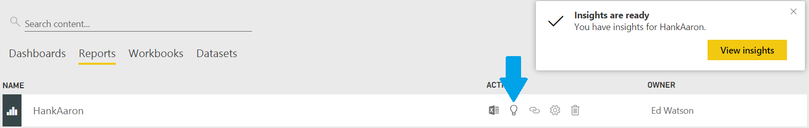
Figure 1 – Quick Insights
This generates some helpful and interesting insights from our dataset. However, some of them might be useless because we know our data and might lead to a “buyer beware” situation. In addition, some of them are obvious to baseball fans, such as Figure 2, but with your data maybe you want a correlation pointed out in the data. We generally know that the more games you play, the more plate appearances you should have. But now we have data to back up the correlation!

Figure 2 – Correlation between Plate Appearances and Games
There were some interesting insights provided such as Figure 3. The tool found a correlation between walks (BB) and age for a certain subset of data: when Hank Aaron played for the Milwaukee Braves. Is that because he became a better, more patient hitter?

Figure 3 – Correlation Between Age and Walks (BB)
In Figure 4, we have an additional correlation, between Strike Outs and Walks (BB) for the Milwaukee Braves. Fascinating!

Figure 4 – Correlation Between Walks and Strike Outs
Keep in mind that there were many insights generated for our data set. Many of them were not useful in this example such as the number of times Hank was caught stealing by the position he played. Because we know the data, there really is not a useful need for this relationship. But we get to decide which insights are useful and save those to our dashboard by clicking on the push pin icon in the upper corner. This will prompt us to select or create a new dashboard, as seen in Figure 5. We will explore dashboards further in day seventeen. Stay tuned!
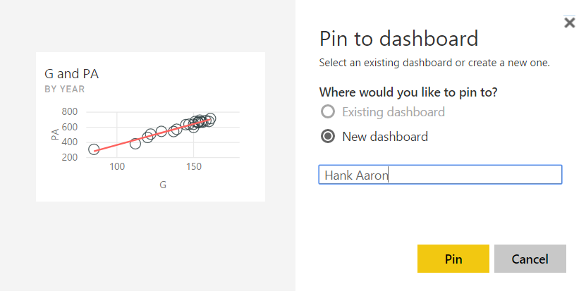
Figure 5 – Pin the Insight to a Dashboard
30 Days to Success in Power BI: Day Fifteen Publishing Our Report
Welcome back to day fifteen of our thirty-day series on Success in Power BI! Have you forgotten where we left off from day thirteen (as we updated on fourteen)? If so, here is the link to refresh your memory. Today we will publish our Power BI Desktop visualizations to a the Power BI service in order to share with other users.
The first step to doing this is creating an account on PowerBI.com. Don’t worry, there is a free account which lets you publish up to 1GB of data, share dashboards, and have access to cloud sources. If you need more than that, pricing information can be found here.
On the top ribbon, select the Publish icon. You will then be prompted for your PowerBI.com account and password as shown in Figure 1.

Figure 1 – Enter Account Information
At this point, the report will be published to the Power BI service as shown in Figure 2 and 3. That was easy, right?
Figure 2 – Publishing to the Power BI service
Our report is now in the cloud! Are you excited yet? I am! Stay tuned to see where we go next!

Figure 3 – Our Report in the Cloud
30 Days to Success in Power BI: Day Fourteen Update Power BI
Welcome back to day fourteen of our thirty-day series on Success in Power BI! Today we will take an opportunity to switch gears as this morning I got a notification on my desktop to update my Power BI installation. This is one of my absolute favorite features of Power BI: MONTHLY UPDATES with new features!
Being a consultant for Innovative Architects, this makes my job much harder because I may tell a client one thing in March and then that is incorrect in April. I am perfectly OK with that because: NEW FEATURES!!!!
So if you are following this blog in real-time, you are going to want to update your Power BI as well to the March 2017 version to prevent any incompatibilities with my version. Look at the features and improvements in Figure 1.
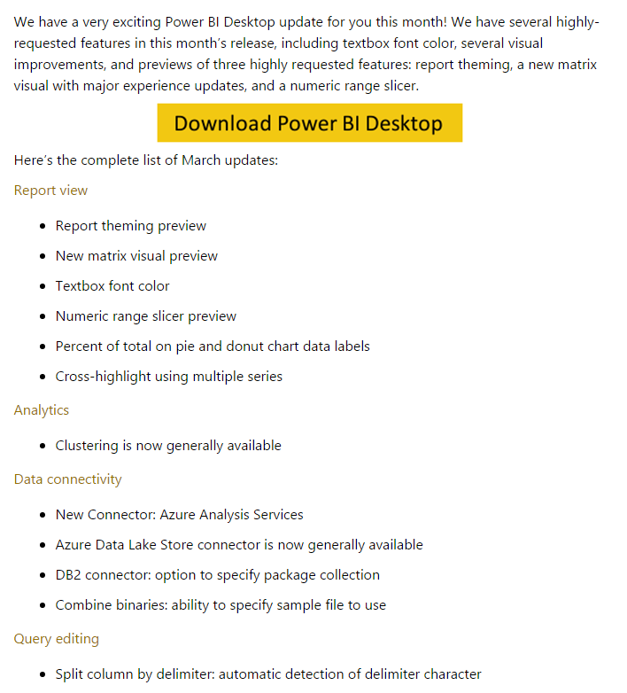
Figure 1 – New Features
Check out the last item on the list…split column by delimiter. Does that sound familiar? It should as we did that manually using calculated columns in Day Ten. This is the perfect example of what I referred to earlier at IA. I may have told a client that you could not easily split a column by delimiter. Now you can. Isn’t that fabulous? Thanks Microsoft! Below is the video from them on the new features.
Stay tuned to see where we go next!

30 Days to Success in Power BI: Day Thirteen Adding Additional Slicers
Welcome back to day thirteen of our thirty-day series on Success in Power BI! Have you forgotten where we left off from day twelve? If so, here is the link to refresh your memory.
While we were away, I tidied up the slicer that we created yesterday with a nice title, a border, I changed the fonts, etc. In other words, I tried to make it match the format of our page as shown in Figure 1. We also selected the Select All Option in the slicer so that we could return to the original functionality of the visuals before the slicer was added. It feels like the same visual theme in our slicer.

Figure 1 – Tidy the Slicer Up
Now we want to add another slicer. Select the home run (HR) field from the Field pane on the right hand of the screen. Select the Slicer from the Visualization pane to turn the new bar graph into a slicer. Select Dropdown and configure it to match the first slicer as mentioned above and shown in Figure 2. Select the ellipses (…) option above the selected slicer object and select Z->A Sort by HR to sort the home runs from most to least in our drop down. Notice that the two slicers are related and limit your options compared to the choices you make in the other slicer. This also filters all of the visuals on your page. This is cool, powerful, and sometimes terribly awkward.

Figure 2 – Home Run Slicer
Now let’s go for broke and add a third slicer. Repeat the above steps using the team (Tm) field only this time let’s leave it as a list of check boxes since Hank only played for three teams. As you can see in Figure 3, we’ve selected the Milwaukee Braves (MLN) and the Milwaukee Brewers (MIL). This filters our other two slicers to rows of data that only matches those two teams. We could at this point slice these down further and this isn’t really the best example for when you would actually need three filters in a visual but I hope it helps you to get a sense that they are all connected and all control the visuals on the page. In other words, all of them are connected and feed off each other. It is unlimited cosmic power, sort of. Use it wisely. Stay tuned for our next adventure!
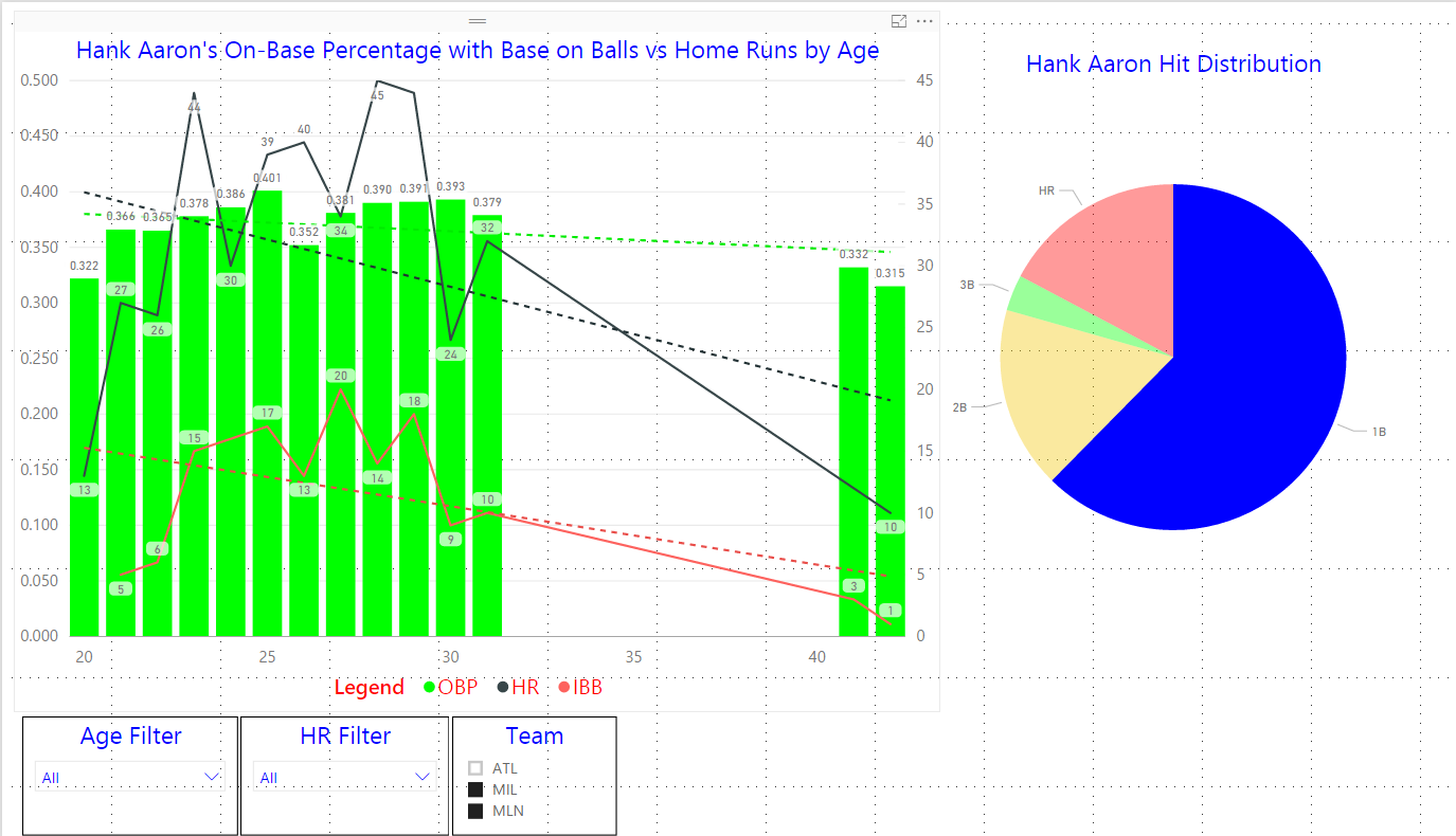
Figure 3 – A Third Filter
30 Days to Success in Power BI: Day Twelve Adding a Slicer

Figure 1 – Slicer
Welcome back to day twelve of our series on Success in Power BI! Here is the link to refresh your memory on yesterday’s work on our Hank Aaron project. We now have two visuals on our page and today we are going to add a slicer. Some of my favorite meals came from slicers…wait that doesn’t seem right. Well in that case just ignore Figure 1.
Just like delicious cold cuts, the Power BI data slicer is used to take a large amount of data and make it smaller. In this case we use slicers to filter data, in other words, to get to the heart of the data. Make sense? It is a visual filter made available on our page to filter through the data in real time. Exciting! Let’s pick up where we left off….remember when I said we needed some extra space at the bottom of the page? Good, you’re now ready to begin if your page looks like Figure 2.

Figure 2 – Let’s Slice This Data Like Roast Beef

Figure 3 – Adding the Age Field
- Click somewhere in the white space at the bottom of the page to ensure that neither of our visuals are selected and then select the Age field in the Fields pane on the right hand side. This will default in a nice little clustered column chart (Figure 3) where it adds the ages from each of our records to give us a grand total of 713. This data is useless as this is not a field to sum up. But we need it here, for now.
- With that visual still selected let’s choose the Slicer in the Visualization pane as shown in Figure 4 using the blue arrow. Our clustered column chart has now changed to a list of check boxes representing each age of data in the data set.
- Check some boxes and watch how the TWO visuals change. We are seeing his totals move depending upon the age. This. Is. Awesome!
- Hold the Ctrl button and select multiple ages and watch the visuals change as shown in Figure 5. Notice the changes in the line and clustered column chart. You can actually see that some ages are missing by the gaps. Even the trend lines move. We must be careful with this to prevent a misleading representation.
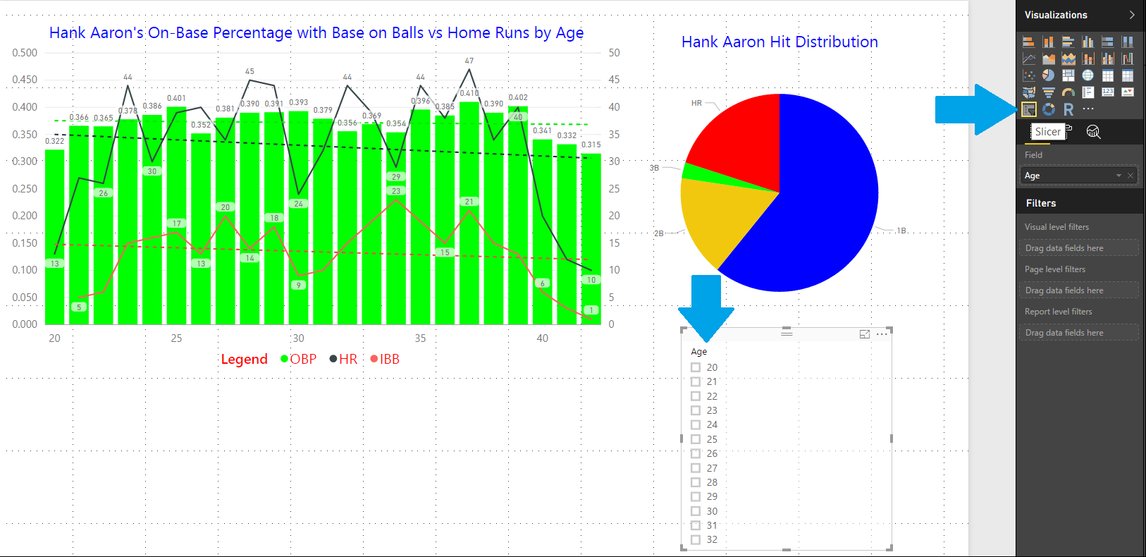
Figure 4 – Slicing Time!
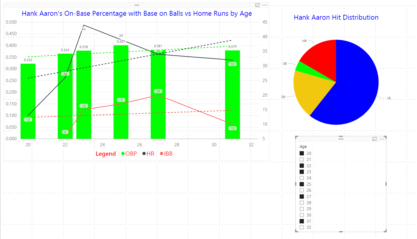
Figure 5 – Slice and Diced
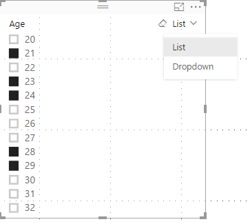
Figure 6 – Drop Down Slicer
That list of check boxes is really unnecessarily expensive in page real estate terms. We can change that into a drop down to prevent losing our valuable visual space. If you hover over it on the right hand corner you will see the word List with a down arrow. Select that and choose Dropdown. Our list is now much smaller as shown in Figure 7. What will we think of tomorrow? Stay Tuned!

Figure 7 – Less Page Real Estate Slicer
30 Days to Success in Power BI: Day Eleven Adding a Second Visual
Welcome back to day eleven of our thirty-day series on Success in Power BI! Need to refresh where we left off from day ten? If so, here is the link. Today we are going to add a second visual to our page.
In order to do that, we need to add another column as these statistics track hits (H), doubles (2B), triples (3B), and home runs (HR) but they do not track singles (1B). I’ve often wondered why when you are looking at a player statistics, the single was relegated as pedestrian to not be depicted in its own column. However, we are going to give it its proper due.
- Go to the data pane on the left hand ribbon.
- Right click somewhere in the data and select Add Column. I wanted to point out that you can skip step one by right clicking on the Fields pane on the right hand side and simply choose Add Column there as well.
- Replace ‘Column =’ with the following (as shown in Figure 1): 1B = ‘Standard Batting'[H] – ‘Standard Batting'[2B] – ‘Standard Batting'[3B] – ‘Standard Batting'[HR]

Figure 1 – Singles Column
Now we are prepared to create a pie chart, but first we must make some room and size down our existing visualization on the page leaving some white space. Click on the white space so that our existing visual is not selected so when we click on the Pie Chart visualization it adds a new visual and does not change our existing line and clustered column chart to a pie chart. Click on the Pie Chart in the Visualization pane as shown in figure 2 with the red arrow.

Figure 2 – Add a Pie Chart
If you notice under the Visualization pane, we have a blank canvas with no fields dragged into fill the pie chart. Select the singles (1B), doubles (2B), triples (3B), and home runs in the Fields pane on the right hand side. This will insert them as values and populate our pie chart as shown in Figure 2. Note that I’ve already made it a little prettier with a change in colors and title. I’ve also added hits (H) to the Tooltips section so that when you hover over home runs for example you can also see how many total hits for example. The hover automagically adds a percentage so it is nice to see what the percentage was based upon.
Figure 3 – Pie Chart Configured
Notice the white space I left at the bottom, that is for tomorrow’s post. Stay tuned!
30 Days to Success in Power BI: Day Ten Add New Calculated Columns
Welcome back to day nine of our thirty-day series on Success in Power BI! Have you forgotten where we left off from day nine? If so, here is the link to refresh your memory.
We are going to switch gears today and manipulate some of our data set for future lessons. We have the Awards field currently which has a few different awards delimited by comma. We want to separate out this data into separate columns to report on.
- Go back to the data view (on the left hand ribbon middle icon).
- Right click anywhere inside the grid and choose New Column (as shown in Figure 1).
- Type in the following (replacing Column = as shown in Figure 2): AllStar = IF((FIND(“AS”,’Standard Batting'[Awards],1,0)) > 0,”Yes”,”No”)
- Repeat steps two and three: GoldenGlove = IF(FIND(“GG”,’Standard Batting'[Awards],1,0) > 0,”Yes”,”No”)

Figure 1 – Adding a New Column
This language is called DAX or Data Analysis Expressions and it is a library of functions and operators that are used to build expressions and formulas for Analysis Services (SSAS), Power BI Desktop, and Power Pivot for Excel. Here is an MSDN reference for DAX. And here is a quick reference that I refer to in order to know which function will fulfill my needs.
To summarize what we did above in the steps: we added two new columns called AllStar and GoldenGlove. We looked at the Awards column for AS or GG and used some DAX functionality to return a Yes or a No into these separate columns. Now these awards have more meaning to use other than the long string of awards for that year. Stay tuned to see how we use them!
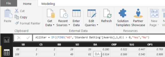
Figure 2 – Using DAX for a New Column

30 Days to Success in Power BI: Day Nine Line and Clustered Column Chart
Welcome back to day nine of our thirty-day series on achieving Success in Power BI! Have you forgotten where we left off from day eight? If so, here is the link to refresh your memory.
Yesterday we made an assertion about Hank Aaron’s on-base percentage (OBP) remaining fairly flat over his career that could have been caused by more walks as a result of him being a home run hitter. This is a common strategy in baseball where the pitcher will walk a home run hitter to prevent a home run when there are runners on base. We should test that theory using our data! Change your visual to the Line and clustered column chart in the Visualizations pane. Your visual should appear like Figure 1.

Figure 1 – Clustered Column Chart with Trends
Now remove the batting average (BA) field from the Column values to avoid confusion as we want to see if walks (BB) correlate with on-base percentages (OB) and home runs (HR) for Hank Aaron. First off, let’s change the title to something a little more reflective of our comparison. Then, add the BB field to the Line values as depicted by the black arrow in Figure 2. Also, notice that a trend line was added for these in a dashed version of the color used to depict the walk line.
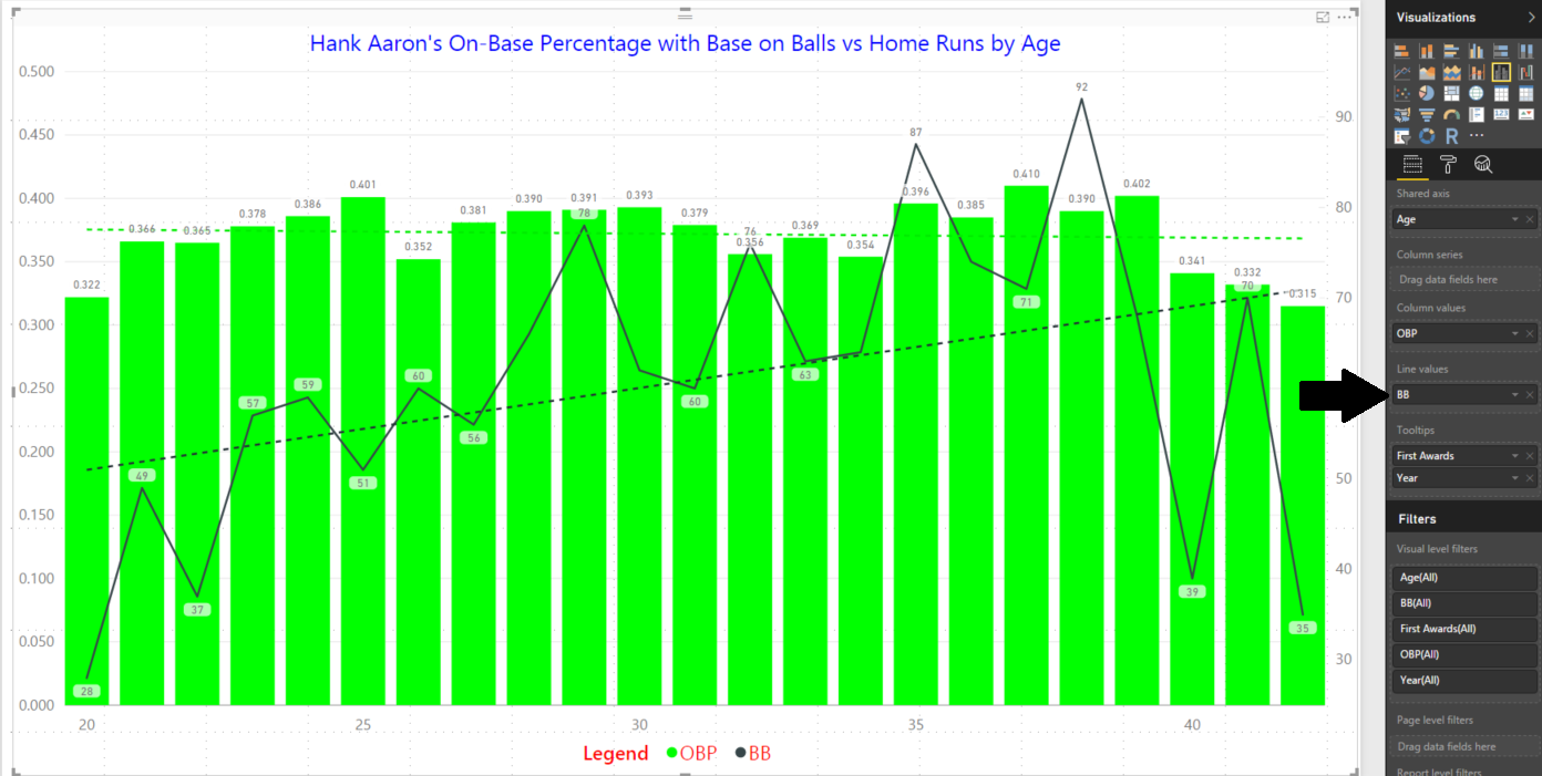
Figure 2 – Adding the Walk Line
Now we will add the home run (HR) field to the Line values area as shown with the red arrow in Figure 3. It is interesting to note that according to the trend line, Aaron’s walks (BB) increased as he got older yet the home runs (HR) decreased, as we would have expected with a declining physical stature. It also doesn’t appear that there is a correlation to walks (BB) versus home runs (HR), at least not a strong one.

Figure 3 – Adding Home Runs
Lucky for us that in 1955 Major League Baseball began tracking intentional walks (IBB) as those were more related to a home run hitter’s prowess. Regular walks could be from poor pitching and were not necessarily intended to pitch around a good hitter. The distinction is important to show correlation in this theory. Also, keep in mind 1955 was Aaron’s second year so we will not see data for his rookie year.
However, there still does not seem to be a correlation as some years like at age 32 he had 44 home runs and only 15 intentional walks and his on-base percentage was lower than most other years despite being a strong home run performance year. Likewise two years later his home run total dropped to 29 but his intentional walks spiked to 23, the highest in his career. The trend for intentional walks does follow the home run trend downward.
Does this data give us an accurate analysis? If we were presenting this to the board with a couple of visualizations that we’ve created, would they make an informed decision? Would you? Stay tuned!

Figure 4 – Replacing Walks with Intentional Walks

30 Days to Success in Power BI: Day Eight Adding More Analytics
Welcome back to day eight of our 30 day series on Success in Power BI! Have you forgotten where we left off from day seven? If so, here is the link to refresh your memory. Let’s remove the Max and Min lines that we added on day seven and add some different analytics to our visual. You should be starting like Figure 1.

Figure 1 – Reset the Area Chart
In the Analytics pane, add a Trend Line as shown in Figure 2. Notice that it inserts a dashed black line, but even more interesting is that it defaults a setting called Combine Series to On. In essence, we are seeing a trend line for both the on-base percentage and the batting average. It is as we would expect with a player aging, his performance trends downward. Change the default for Combine Series to Off and let’s see how it changes our story.
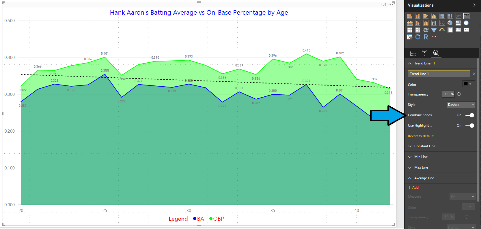
Figure 2 – Combined Trend Line
Now we have TWO trend lines as shown in Figure 3, one for OBP and one for BA. In addition, they are defaulted to the colors of the original lines but these are dashed for delineation: Automagically!!! Now when we compare those two sets of trend lines (Figures 2 and 3) you should see a different slope. The on-base percentage was more flat and consistent while the batting average dropped more rapidly than the combined line. That is fascinating and it shows that even as he aged he was still consistently able to get on base. Being a home run hitter, some of that was attributed to more walks as pitchers would rather give up an intentional walk than a home run especially with runners on base. Let’s look at that in a future day. Changing this setting altered our story and gave us more insight than a combined trend line. It may not always.
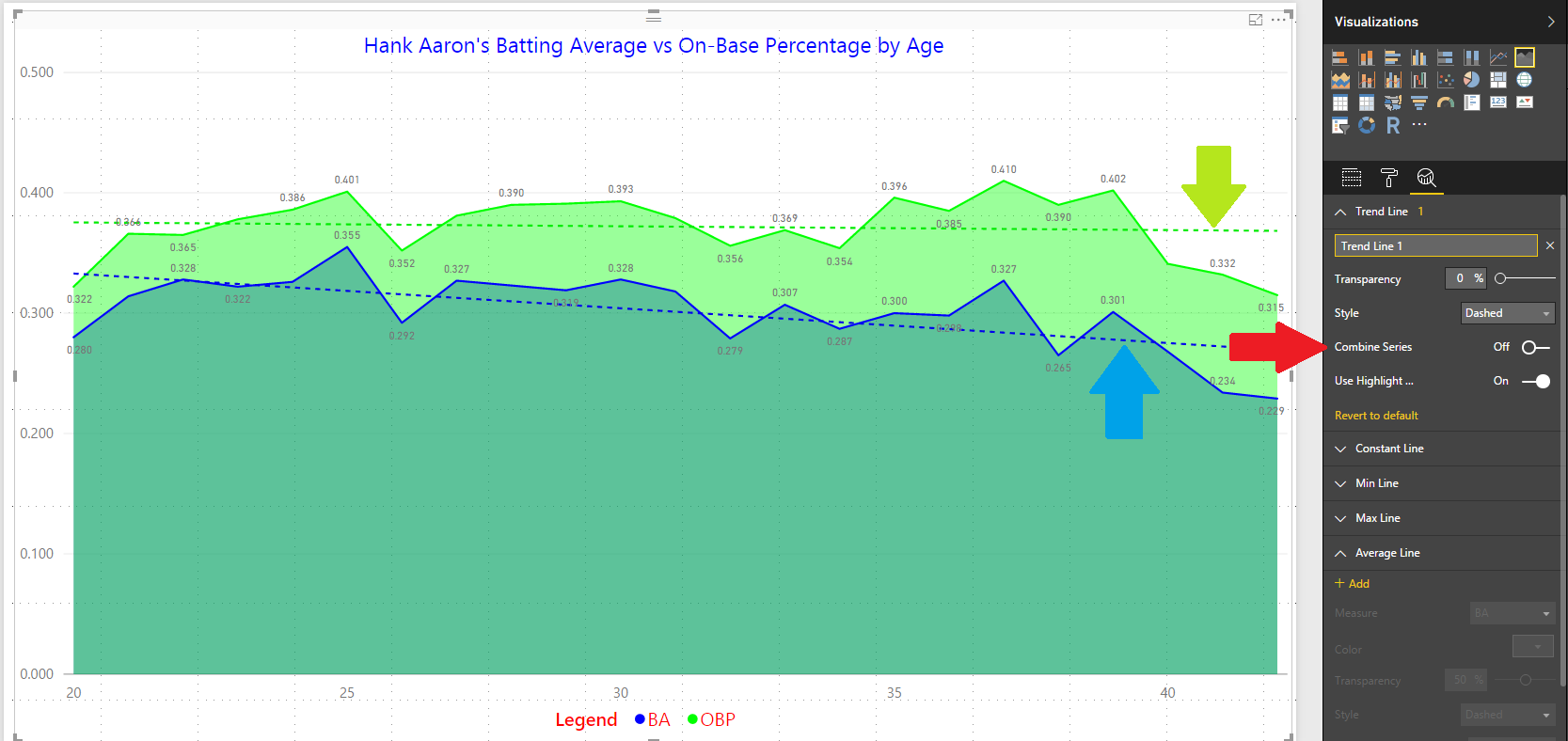
Figure 3 – Separate Trend Lines
What else can we do as far as analytics are concerned? Well…we can also add Average Lines, Median Lines, and Percentile Lines. Give them all a try to see what the differences are. But, a click or two and you have added instant analytics in your visuals. Pretty nifty, huh? Stay tuned for more Power BI!

30 Days to Success in Power BI: Day Seven Adding Simple Analytics
Welcome back to day seven of our series on Success in Power BI! With 30 days of Power BI learning, we should be able to be successful with our use of the desktop tool. Have you forgotten where we left off from day six? If so, here is the link to refresh your memory.
What more can we do with our visualization? What if we do not like the Line Chart visual? If you select the Area Chart visual you can quickly change your visual to the graph shown in Figure 1.
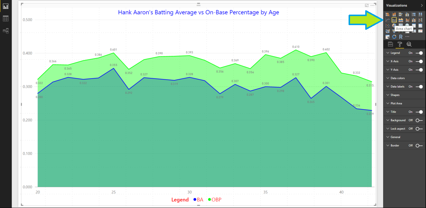
Figure 1 – Easily Switched to an Area Chart
Try some other visuals. Better yet, try them all. Personally, I do not think any of the other visuals work with this set of selected values. For example, in Figure 2 we see a Clustered Column Chart which to me isn’t as easy to see the natural trend line but it works. I think the original Area Chart works best in this scenario. Let’s switch back to that visual moving forward.
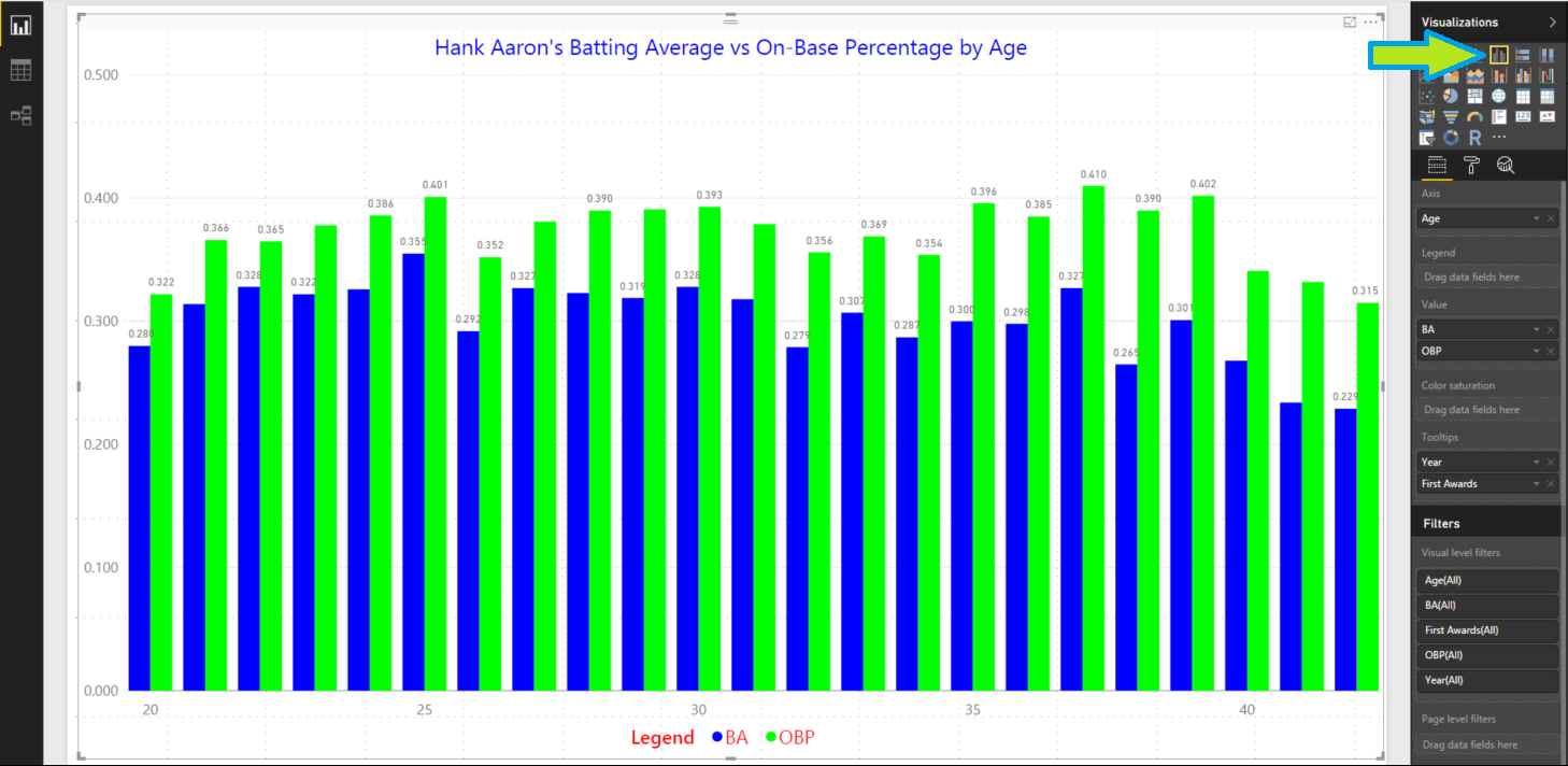
Figure 2 – Clustered Column Chart
Speaking of trend lines, let’s add some simple analytics such as a Min and Max line. We can easily add a Min line for the BA and the OBP. Select the third icon in the pane below the Visualizations called Analytics as shown in Figure 3 with the red arrow. Select Min Line and add two Min Lines and configure them as shown with the blue arrows. We need the colors and alignment to show in our area chart. For batting average, I used a bright yellow line and for on-base percentage a red. I then used a black font and moved it to the right and under the line. If the colors are hard to see you could switch back to a regular line chart to prevent the color clash.

Figure 3 – Adding Min Lines
Now we can do the same to add in some Max Lines using straight lines with the same respective color for either OBP or BA as showing in Figure 4. I changed these to be solid lines to avoid confusion. The visual is sort of busy but it works, right? Maybe the color choices are not perfect and those can always be tweaked. But we’ve added some base analytics to our visual. We are rock stars, right? Stay tuned for more.
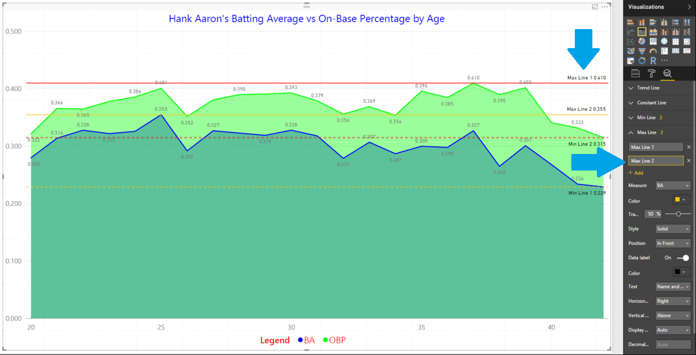
Figure 4 – Adding Max Lines


