30 Days to Success in Power BI: Day Eighteen Choosing the Right Visual
Welcome back to day eighteen of our thirty-day series on Success in Power BI! Have you forgotten where we left off from day seventeen? If so, here is the link to refresh your memory.
Let’s look at visuals today. The hardest part to designing a Power BI report is deciding which visuals to use that will best convey the message of your report or dashboard. I could go into a detailed analysis of each of the default visuals, but a few days ago I came upon the following visual reference from SQLBI.com (which is an excellent and highly recommended Power BI reference site) and thought I would pass it along instead of reinventing the wheel:
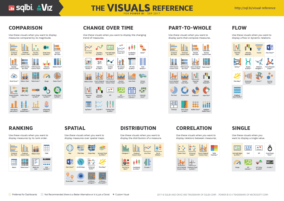
The page where the image was found (http://www.sqlbi.com/ref/power-bi-visuals-reference/) has a download option for the PDF for your daily use. Enjoy!
Posted on October 4, 2017, in Business Intelligence, PowerBI and tagged PowerBI. Bookmark the permalink. 1 Comment.


Pingback: 30 Days to Success in Power BI: Day Nineteen Take Power BI to Another Level | SQL Swampland