30 Days to Success in Power BI: Day Thirteen Adding Additional Slicers
Welcome back to day thirteen of our thirty-day series on Success in Power BI! Have you forgotten where we left off from day twelve? If so, here is the link to refresh your memory.
While we were away, I tidied up the slicer that we created yesterday with a nice title, a border, I changed the fonts, etc. In other words, I tried to make it match the format of our page as shown in Figure 1. We also selected the Select All Option in the slicer so that we could return to the original functionality of the visuals before the slicer was added. It feels like the same visual theme in our slicer.

Figure 1 – Tidy the Slicer Up
Now we want to add another slicer. Select the home run (HR) field from the Field pane on the right hand of the screen. Select the Slicer from the Visualization pane to turn the new bar graph into a slicer. Select Dropdown and configure it to match the first slicer as mentioned above and shown in Figure 2. Select the ellipses (…) option above the selected slicer object and select Z->A Sort by HR to sort the home runs from most to least in our drop down. Notice that the two slicers are related and limit your options compared to the choices you make in the other slicer. This also filters all of the visuals on your page. This is cool, powerful, and sometimes terribly awkward.

Figure 2 – Home Run Slicer
Now let’s go for broke and add a third slicer. Repeat the above steps using the team (Tm) field only this time let’s leave it as a list of check boxes since Hank only played for three teams. As you can see in Figure 3, we’ve selected the Milwaukee Braves (MLN) and the Milwaukee Brewers (MIL). This filters our other two slicers to rows of data that only matches those two teams. We could at this point slice these down further and this isn’t really the best example for when you would actually need three filters in a visual but I hope it helps you to get a sense that they are all connected and all control the visuals on the page. In other words, all of them are connected and feed off each other. It is unlimited cosmic power, sort of. Use it wisely. Stay tuned for our next adventure!
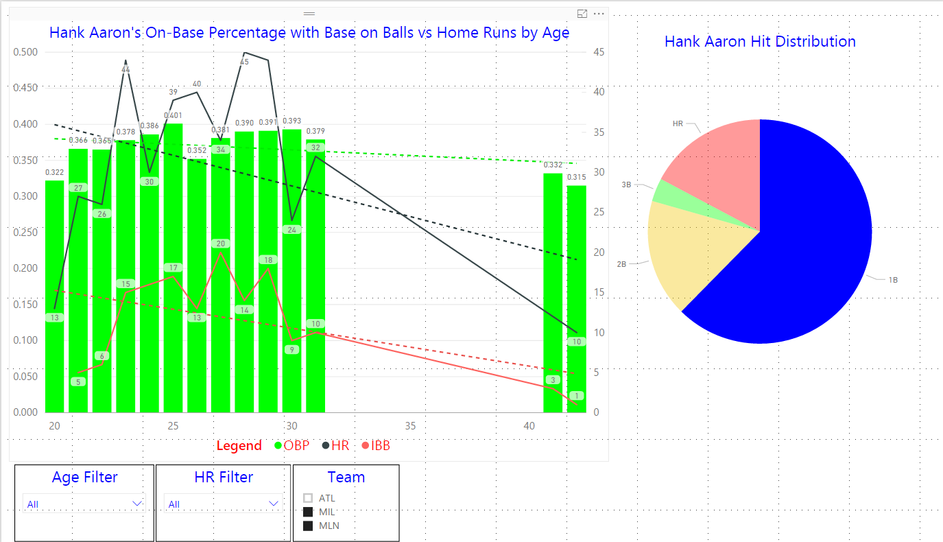
Figure 3 – A Third Filter
Posted on March 9, 2017, in Business Intelligence, PowerBI and tagged PowerBI. Bookmark the permalink. 1 Comment.


Pingback: 30 Days to Success in Power BI: Day Fifteen Publishing Our Report | SQL Swampland