Couch Con Live 2020: Taking Power BI to the Next Level
Watch my session entitled Taking Power BI to the Next Level from Couch Con 2020.
Summit v.20: The Most Wonderful Time of the Year
It is hard to believe that this year will be the 20th PASS Summit. What is even more difficult to believe is that this will be my seventh trip to the conference. I have never before stopped to count the number until now and to be honest it feels like that number is much lower than I would’ve thought it would’ve been as it feels like a part of my soul.
PASS Summit is an annual pilgrimage to Mecca. A journey that we all make in the Autumn to dip our bodies in the ever-loving glow of SQL Server. It is a chance to spend a week with thousands of like-minded people all with which love data. From beginners to experts, we come from all corners of the world to descend upon Seattle and mingle with Microsoft all in the name of learning and networking in the world of data. Ahhhhh, I am excited once again writing these words and thinking about the things I will do the first week of November in the Pacific Northwest. My bags are packed and I am ready to go but I am getting a little ahead of myself as the trip is not for another six weeks.
Will you be there? Are you on the fence? Do you need a gentle push? Feel free to ask me anything here or on twitter. Let me also remind you that next week the price will be going up so maybe you need to act today! Register Now! Come by and say hi and introduce yourself as I would love to meet you in Seattle.
30 Days to Success in Power BI: Day Twenty-Four Themes
Welcome back to day twenty-four of our thirty-day series on Success in Power BI! Have you forgotten where we left off from day twenty-three? If so, here is the link to refresh your memory.
When Power BI first debuted, one of the features that it lacked was the ability to change a color scheme on a wholesale basis. At that point (and still today) you can change colors for individual data points and that can be tedious with a lot of data points and/or trying to match up corporate color schemes or with existing corporate SSRS reporting standards. With the advent of Themes in Power BI, you can change a color theme for an entire report easily and quickly and copy that into your next report.
There is one important caveat if you have existing reports: If you have modified all of the colors in a report, implementing a Theme will not change the existing color scheme in a report as you’ve customized those colors already and the theme will not change that. This could be considered a feature or a bug depending upon your perspective. Microsoft considers that a feature. Plan accordingly.
The color themes are simple JSON files that look like the following (this one we created at the following site https://powerbi.tips/tools/advanced-color-theme-generator/):
{
	"name": "MyTheme",
	"dataColors": [
		"#121a56",
		"#2337c7",
		"#23abc7",
		"#23c77b",
		"#23c730",
		"#c423c7",
		"#c73223"
	],
	"background": "#c7c423",
	"foreground": "#b223c7",
	"tableAccent": "#0b090c"
}
In order to change themes, we select the Switch Theme button on the main ribbon, as shown in Figure 1. Power BI gives us a few provided options. We can also download themes from the Microsoft Power BI community.

Figure 1 – Themes
Here we have returned to our Hank Aaron data and reports from earlier in the series. The colors in Figure 2 are before we apply any theme. We could use the JSON file that I created above to get a new color theme.
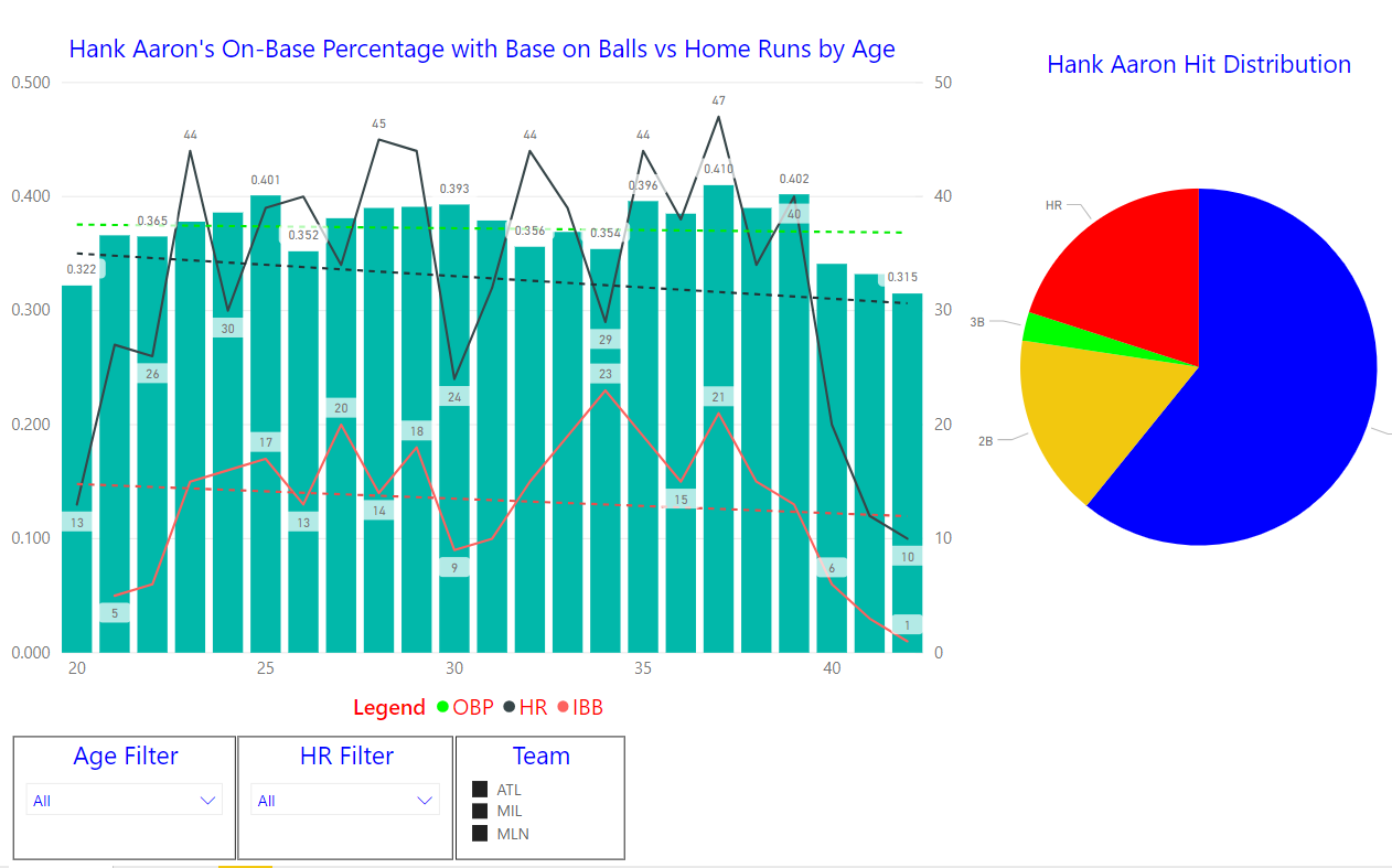
Figure 2 – Before Theme
After choosing Import Theme from the Switch Theme ribbon, we chose our manually created JSON file to produce the following hideous report shown in Figure 3. Notice that some colors such as in the pie chart never changed. We covered that earlier, they will not change as they’ve been customized. We probably should have created a corporate color scheme or gone with one of the provided themes. as this looks horrible. Have fun with your color themes, but not this much fun. Stay tuned!

Figure 3 – After Theme
30 Days to Success in Power BI: Day Twenty-Three Drillthrough
Welcome back to day twenty-three of our thirty-day series on Success in Power BI! Have you forgotten where we left off from day twenty-two? If so, here is the link to refresh your memory.
Today we will be discussing Drillthrough. Drillthrough allows you to drill through to more details. For example, you have a chart that summarizes Sales Amounts by Years. When you see this visualization, you realize that it would be useful to be able to drill through the chart and see all of the data that is summarized for the selected year. Let’s try this using our AdventureWorksDW2014 data-driven Power BI report from the last few posts. If you remember we had a Stacked Column Chart displaying Sales Amount by the Order Date hierarchy.
Let’s create a second report page and name it Order Details. On this page, add Order Date (as a date and not a hierarchy) and Sales Amount from FactInternetSales and FirstName and LastName from DimCustomer. This will give us some basic order details as shown in Figure 1.
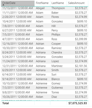
Figure 1 – Order Details
On the Order Details page, drag the Year value from Order Date in FactInternetSales to the Drillthrough filter area as shown in Figure 2. This will be our link to the main page to allow us to drillthrough based on the year of the order date. So when we are viewing Sales by Year on our main chart, we can choose to drillthrough and see all of the individual order that made up that year.

Figure 2 – Drillthrough Filter
Keep in mind that you can hide these drillthrough detail report pages and allow them only to be seen on the drill through action. Because of this feature, Power BI places an arrow in the upper left hand corner to allow you to return from whence you came. You can edit the appearance of the arrow and when the end-user presses the arrow they are returned to the original report. Personally, I chose to make the arrow a little larger and change the color to red to make it more obvious as shown in Figure 3. We should also at this point name the report page tab at the bottom of the report so that when we try to drill through it will be obvious as to what page we want to drillthrough to as shown in Figure 4. Here we see the page name of Order Details to the right of the drillthrough menu. If there were multiple pages we would have to choose a particular page here.

Figure 3 – Detail with Return Arrow
So now that we’ve gotten a little ahead of ourselves, let me explain how we got to that menu. In our Stacked Column Chart, we are at the Sales Amount by Year hierarchy level of our visual, thus the OrderDate year is in scope for our data. This is important because we chose Year as our drillthrough filter. If we right-click on one of the years inside the chart, we can drill through as shown in Figure 4. If you are not hovering over a particular year, then the drillthrough option will not be available in the context menu. It is also important to note that if you drill down or move to the next level and do not have year in scope, then the drillthrough feature to the year filter on Order Details will not be available. Similarly, you could create additional report pages to provide different details to those levels as well. Stay tuned for our next adventure with Power BI!!!

Figure 4 – Let’s Drillthrough Now!
30 Days to Success in Power BI: Day Twenty-Two Drill Down Visuals
Welcome back to day twenty-two of our thirty-day series on Success in Power BI! Have you forgotten where we left off from day twenty-one? If so, here is the link to refresh your memory.
Now that we’ve learned how to drill down in a matrix table, let’s see how to drill down in a visualization. Highlight the matrix that we used in days twenty and twenty-one and select the Stacked Column Chart in the visualization menu. This will convert our matrix table to the stacked column chart using the same selected fields OrderDate and SalesAmount as shown in Figure 1.
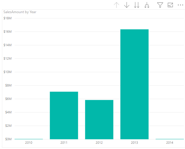
Figure 1 – Stack Column Chart
This is the same data now represented as a chart. If we right click on one of the stacks, as shown in Figure 2, we see a Drill Down option. Notice that there is also a Show Next Level and Expand to Next Level options.

Figure 2 – Drill Down Options
- If we choose Drill Down it takes us to Sales Amount by Year and Quarter and in this case it is 2013.
- If we choose Show Next Level, it takes us to Sales Amount by Quarter. This is an aggregation for all years by quarter. There is a difference here between seeing a drill down into 2013 data and looking at the next level of the hierarchy.
- If we choose Expand to Next Level, as shown in Figure 3, we see a break-down by year and quarter for Sales Amount.
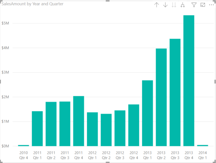
Figure 3 – Aggregates by Year and Quarter
These are subtle differences but very important differences. We can continue drilling up or down to see the various levels for this chart in much the same way that we did for the matrix table. Note that the up and down arrows are available above the visualization here as well. Stay tuned for the drillthrough in our next installment.
30 Days to Success in Power BI: Day Twenty-One Drill Down
Welcome back to day twenty-one of our thirty-day series on Success in Power BI! Have you forgotten where we left off from day twenty? If so, here is the link to refresh your memory. In our last post, we saw how to setup the drill down capability. Today we will see it in action.
To recap quickly, we were using the AdventureWorksDW2014 data warehouse and we added SalesAmount and OrderDate from the FactInternetSales table. We want to insert a matrix table onto the report as those work with the drill down feature whereas the regular table visualization does not.

Figure 1 – Initial Sales Amounts
In Figure 2, we can see drill down icons for the Matrix visualization. The down arrow on the right side of the toolbar enables the drill down capabilities for the visualization. The three arrow icons in the left hand corner have the following functionality:

Figure 2 – Drill Down Icons
- The Up Arrow drills up a level from the current level of the hierarchy.
- The Double Arrow drills down to the next level of the hierarchy (as seen in Figure 3).
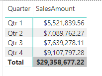
Figure 3 – Move Down One Level
- The Single to Double Arrow expands down all to the next level of the hierarchy (as shown in Figure 4).
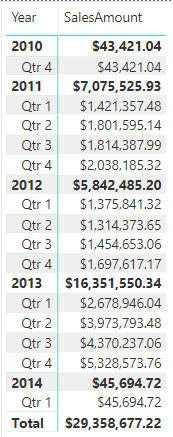
Figure 4 – All Down One Level
With this feature we can roll up and down allowing Power BI to do the aggregations along the way. In Figure 5, we can see the bottom level showing sales aggregates for year, quarter, month, and day. At this point you can visualize the roll up for the totals. We have now learned to use the drill down feature of Power BI. Congratulations!

Figure 5 – All The Way Down
30 Days to Success in Power BI: Day Twenty Drill Down Setup
Welcome back to day twenty of our thirty-day series on Success in Power BI! Have you forgotten where we left off from day nineteen? If so, here is the link to refresh your memory.
Today we are going to demonstrate the drill down functionality in Power BI. One of the key requirements for the drill down feature is the need for a hierarchy to allow us to drill up and/or down. The previous Hank Aaron data did not lend itself well to hierarchies. One of the most common automatic hierarchies is the date hierarchy. When we have a date field in our data, Power BI will automatically generate a date hierarchy which consists of year, month, day, and quarter. That gives us four levels to drill up or down with.
Because it is common in business intelligence reporting to generate reports from the data warehouse, it seems only logical that we are going to use the AdventureWorksDW2014 version of sample data to demonstrate this functionality. The free sample data warehouse database can be download from Microsoft here.
For demonstration purposes, connect to the AdventureWorksDW2014 database and load the fact and dimension tables as shown in Figure 1 below.

Figure 1 – Load OrderDate Hierarchy and SalesAmount
Notice how OrderDate is split out into Year, Quarter, Month, and Day fields. This is a hierarchy. If we do not want to have one of these levels in our hierarchy we can remove it here by selecting the X on the right side of the field on the left side of Figure 1. For example, maybe we do not care to get aggregate rollups for quarters, therefore we can remove the Quarter field from this hierarchy here. Thus our drill down will only consist of year, month, and day aggregations.
At the same time, I should mention that if we chose not use the drill down functionality on this particular field hierarchy and we just want to view the date as a date, we can switch back to a regular date field as shown in Figure 2.
Stay tuned to the next installment to see the drill down in action!

Figure 2- Selecting a Regular Date Instead
30 Days to Success in Power BI: Day Nineteen Take Power BI to Another Level
Welcome back to day nineteen of our thirty-day series on Success in Power BI! Have you forgotten where we left off from day eighteen? If so, here is the link to refresh your memory.
For the next few blog posts we are going to discuss taking Power BI to another level. We are going to discuss drill down (or up) and drillthrough.
Let’s explain the terminology first!
With drill down, we can go from a high level on a report like Year to Date Sales to the lowest detail that we wish to show. We can decide how many levels of drilling. So let’s say our first level is corporate-wide so we might see one row for 2017 that has sales data totals for the entire corporation. If we drill down to the next level, we can see that inside the corporation we now have totals by global regions. If we drill down a little further we might see totals by country and then totals by smaller regions and so on. Drilling up is simply going back up that chain. This adds an entirely new dimension to our reports that eliminates the need for multiple static reports.
Drillthrough, on the other hand, provides the ability to drill through to another page or report for detail and thus filter by the field that you selected when you chose drillthrough. For example, when we have our drill down and we get to the country detail on our report mentioned above, we could drillthrough to a second report that shows sales details and it would then filter by that country.
If this sounds a little confusing, do not fret…we will go through it in the next couple of posts. Stay Tuned!
30 Days to Success in Power BI: Day Eighteen Choosing the Right Visual
Welcome back to day eighteen of our thirty-day series on Success in Power BI! Have you forgotten where we left off from day seventeen? If so, here is the link to refresh your memory.
Let’s look at visuals today. The hardest part to designing a Power BI report is deciding which visuals to use that will best convey the message of your report or dashboard. I could go into a detailed analysis of each of the default visuals, but a few days ago I came upon the following visual reference from SQLBI.com (which is an excellent and highly recommended Power BI reference site) and thought I would pass it along instead of reinventing the wheel:
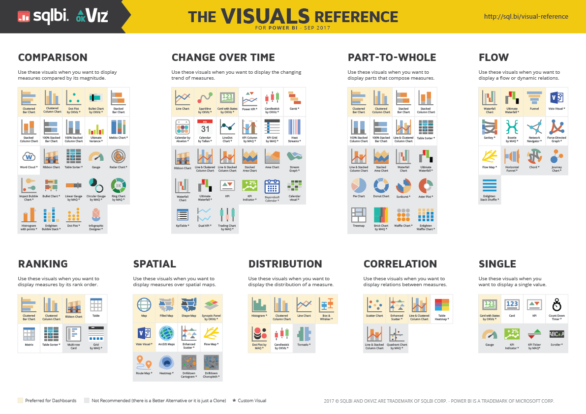
The page where the image was found (http://www.sqlbi.com/ref/power-bi-visuals-reference/) has a download option for the PDF for your daily use. Enjoy!

30 Days to Success in Power BI: Day Seventeen Asking Questions
Welcome back to day seventeen of our thirty-day series on Success in Power BI! Have you forgotten where we left off from day sixteen? If so, here is the link to refresh your memory. Now that we have some insights loaded into our dashboard on PowerBI.com, we can use the Q&A feature of Power BI. What is Q&A?
It is just what you think it would be: question and answer, only this time your Power BI dashboard end-user asks the question of your data and the software returns an answer!!!! This sounds like some straight-up Skynet Terminators taking over the world science fiction, right? Well, of course, we are data people so now WE HAVE THE ULTIMATE COSMIC POWER!!! OK, maybe not that cool, but still!
Let’s dive in and take a look! In Figure 1, we see our original dashboard and if you look right above the pinned insight “G and PA” you can see the “Ask a question about your data” field area where we can begin typing. Once you click into this field it will show you a different screen without the pinned visualizations and will show you some sample columns to select or you can begin typing your question.

Figure 1 – Dashboard
In essence, Q&A provides answers in the form of charts and graphs to natural language questions in real-time type-ahead fashion. Watch the progression in Figures 2 through 5 as we type ‘hr by year’ as our question. Also, notice that typing HR first gives us a 755 HR total in the chart responding to our request. Remember that our dataset is called Standard Batting so you can see that Figure 2 shows us the HR column of that dataset as a selection. This is useful if the column was found in multiple locations.

Figure 2 – Typing HR for Home Runs

Figure 3 – Continuing to Type for Home Runs

Figure 4 – Power BI Guessing the Column is Year

Figure 5 – Now We Have an Answer to Our Question
We’ve now successfully utilized the Q&A feature of PowerBI.com. If you did not see that feature, make sure that you have it turned on as shown in Figure 6 below. Stay tuned for the next day in this series!

Figure 6 – Turn on Q&A in the Dashboard Settings


